edgekit.viz
The chart vocabulary for backtest results: matplotlib on the Agg backend, base64-inlined so a chart embeds in a report with zero external requests. Charts consume the canonical trade frame (date + r + dir); the daily/monthly series are derived by trades_to_daily / trades_to_monthly.
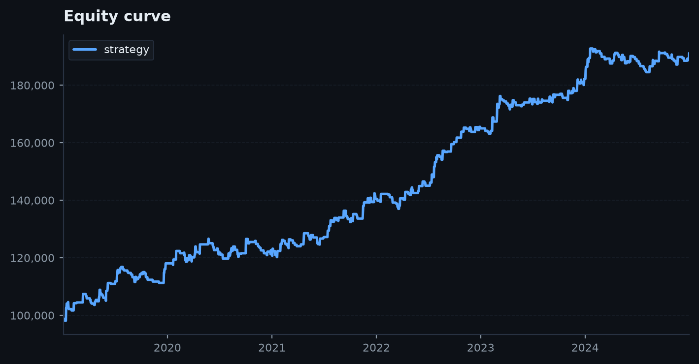
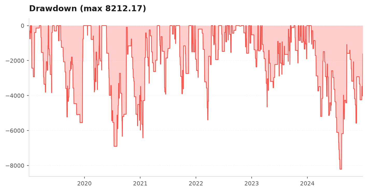
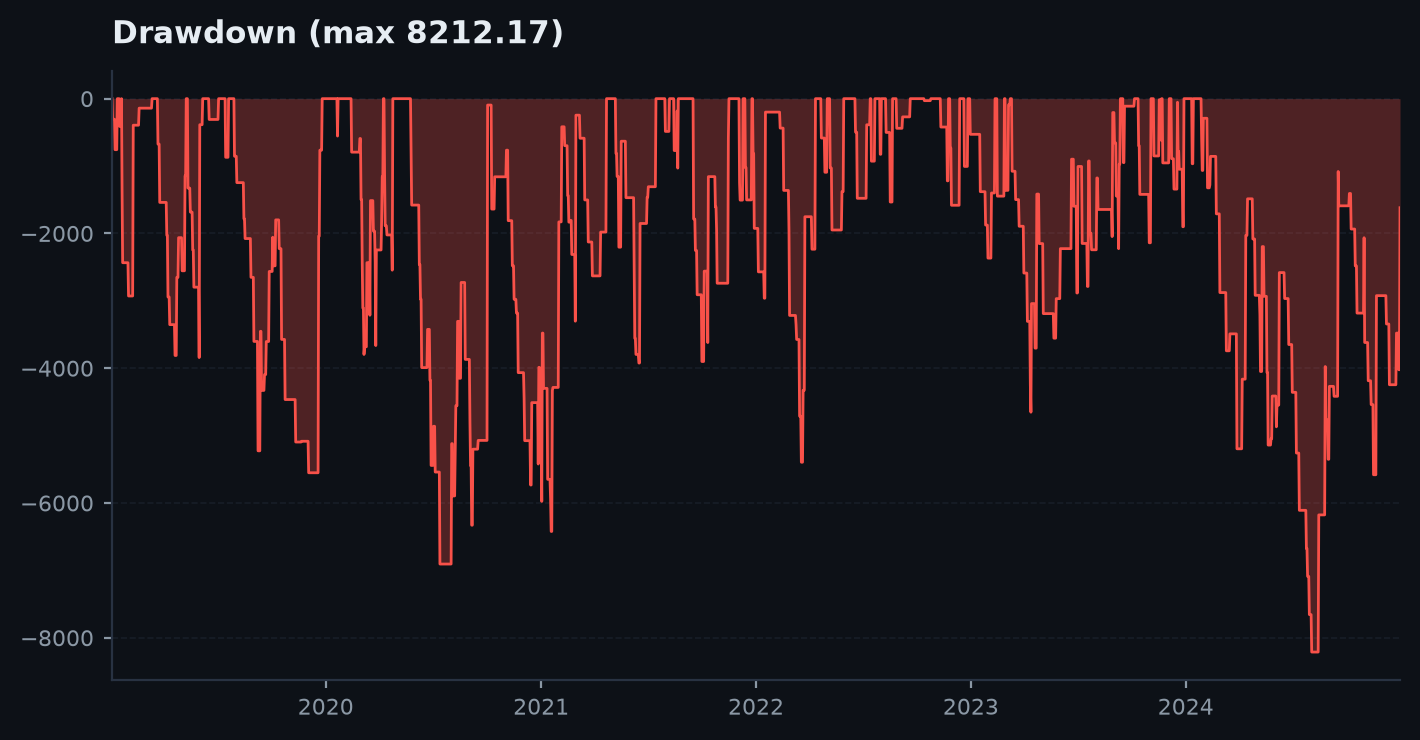
Every chart below is previewed inline. For the full set in one place, see the chart gallery.
What's inside. Series helpers (trades_to_daily, trades_to_monthly), a PNG encoder (fig_to_base64), the THEMES palette, axes-level plotters that draw onto a supplied ax (equity_curve, drawdown, monthly_bars, yearly_bars, r_histogram, draw_candles, trade_overlay), and figure-level builders that return a Figure (monthly_heatmap, mc_fan, corr_heatmap).
viz._plt()). A missing install raises an ImportError with a clear pointer to pip install edgekit[viz] — so import edgekit stays lean. Install the extra before calling any chart.Themes#
THEMES is a dict with two palettes: "dark" (GitHub-dark, #0d1117 background) and "light" (blue-accent print). Each has keys bg, text, card, border, heading, muted, green, red, blue, gold. theme(name="dark") looks one up.
from edgekit import viz
th = viz.theme("dark")        # -> {"bg": "#0d1117", "green": "#3fb950", ...}
th = viz.THEMES["light"]
Series helpers#
trades_to_daily#
Trade frame (date + r) → net R per calendar day on a gap-filled calendar (0 on untraded days). If account is given it is treated as dollars-per-R and the series is scaled to dollars.
trades_to_daily(trades: pd.DataFrame, account: float | None = None) -> pd.Seriestrades— canonical trade frame withdate+r.account— dollars-per-R scalar; if given, the series is in dollars.
trades_to_monthly#
Trade frame → month-end ("ME") summed series (R, or dollars if account given).
trades_to_monthly(trades: pd.DataFrame, account: float | None = None) -> pd.Seriesdaily = viz.trades_to_daily(trades) # net R per calendar day
monthly = viz.trades_to_monthly(trades, account=500.0) # dollars per monthEncoding#
fig_to_base64#
Render a figure to a base64 PNG string and close it — the primitive every inlined chart uses.
fig_to_base64(fig, dpi: int = 95) -> strb64 = viz.fig_to_base64(fig) # a base64 PNG; embed as data:image/png;base64,{b64}save_png#
Write a figure to disk (tight bbox, theme facecolor kept) and close it — the on-disk twin of fig_to_base64 for when a report wants a real PNG rather than an inline data-URI. Returns the pathlib.Path.
save_png(fig, path, dpi: int = 115)fig— the matplotlib figure to write (it is closed after saving).path— destination path (str orPath); returned as aPath.dpi— render resolution (default115, higher than the inline95).
p = viz.save_png(viz.equity_with_drawdown(daily.cumsum()), "equity.png") # -> Path("equity.png")Axes-level charts#
Each plots onto a supplied ax and returns it — compose several into one figure.
equity_curve(ax, eq, label: str | None = None, color: str | None = None)
drawdown(ax, eq, cap: float | None = None, color: str | None = None)   # underwater; cap draws the hard-limit line
monthly_bars(ax, monthly, green=None, red=None)
yearly_bars(ax, yearly, color=None)
r_histogram(ax, r, color=None)
draw_candles(ax, seg: pd.DataFrame, up=None, down=None)                # OHLC candles: wicks + bodies
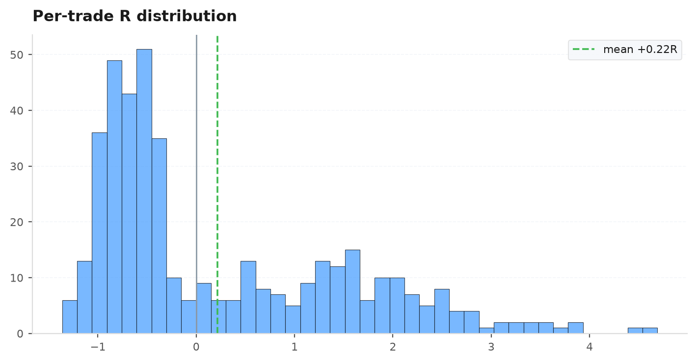
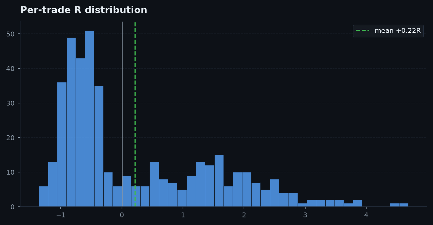
trade_overlay(ax, trades: pd.DataFrame) # up-triangle long / down-triangle short, coloured by Requity_curve— line plot of a cumulative equity series.drawdown— the underwater curve;capdraws the hard drawdown-limit line.monthly_bars/yearly_bars— green/red bars of a monthly/yearly return series.r_histogram— histogram of per-trade R with the mean marked.draw_candles— OHLC candles (wicks + bodies) from an OHLC segment.trade_overlay— entry markers coloured by R, drawn over a candle chart.
plt = viz._plt()
daily = viz.trades_to_daily(trades)
monthly = viz.trades_to_monthly(trades)

fig, axes = plt.subplots(2, 3, figsize=(14, 7))
viz.equity_curve(axes[0, 0], daily.cumsum(), label="equity")
viz.drawdown(axes[0, 1], daily.cumsum(), cap=0.10)     # 10% hard-limit line
viz.monthly_bars(axes[0, 2], monthly)
viz.yearly_bars(axes[1, 0], daily.groupby(daily.index.year).sum())
viz.r_histogram(axes[1, 1], trades["r"])
viz.draw_candles(axes[1, 2], bars.iloc[-40:])
viz.trade_overlay(axes[1, 2], trades.tail(10))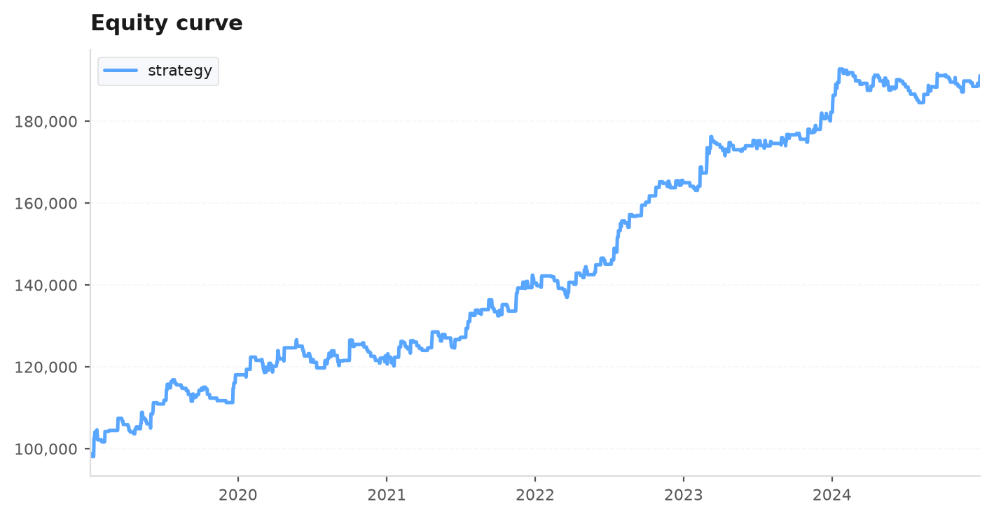
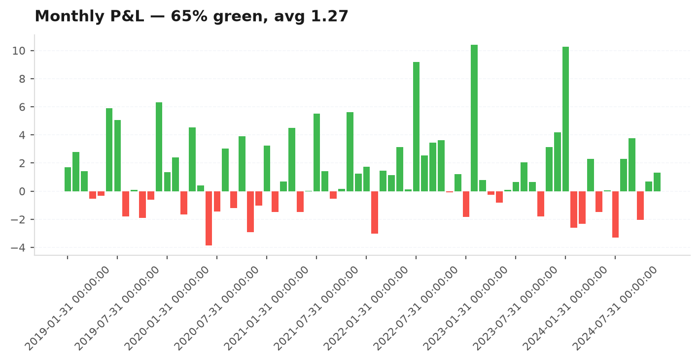
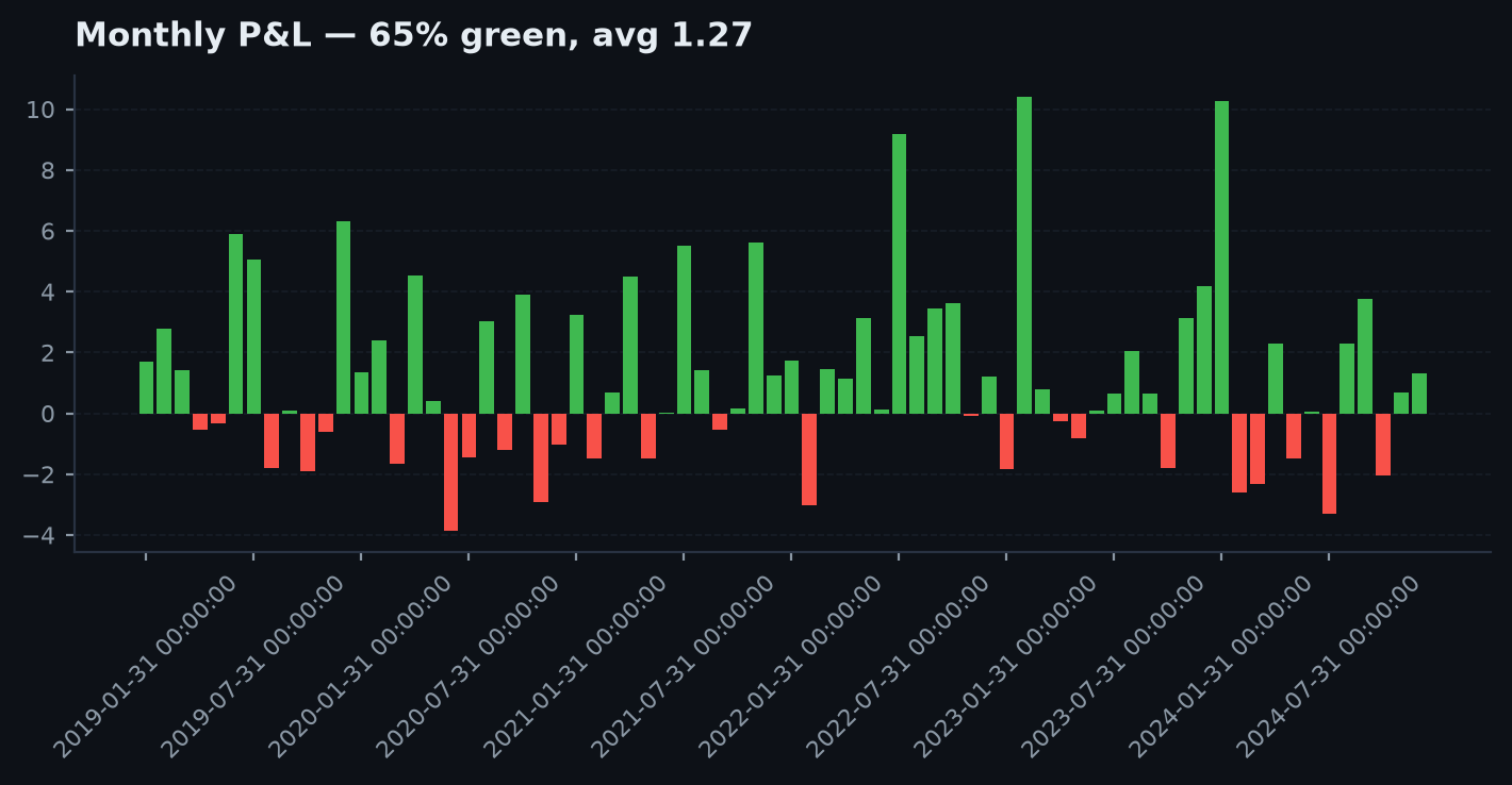
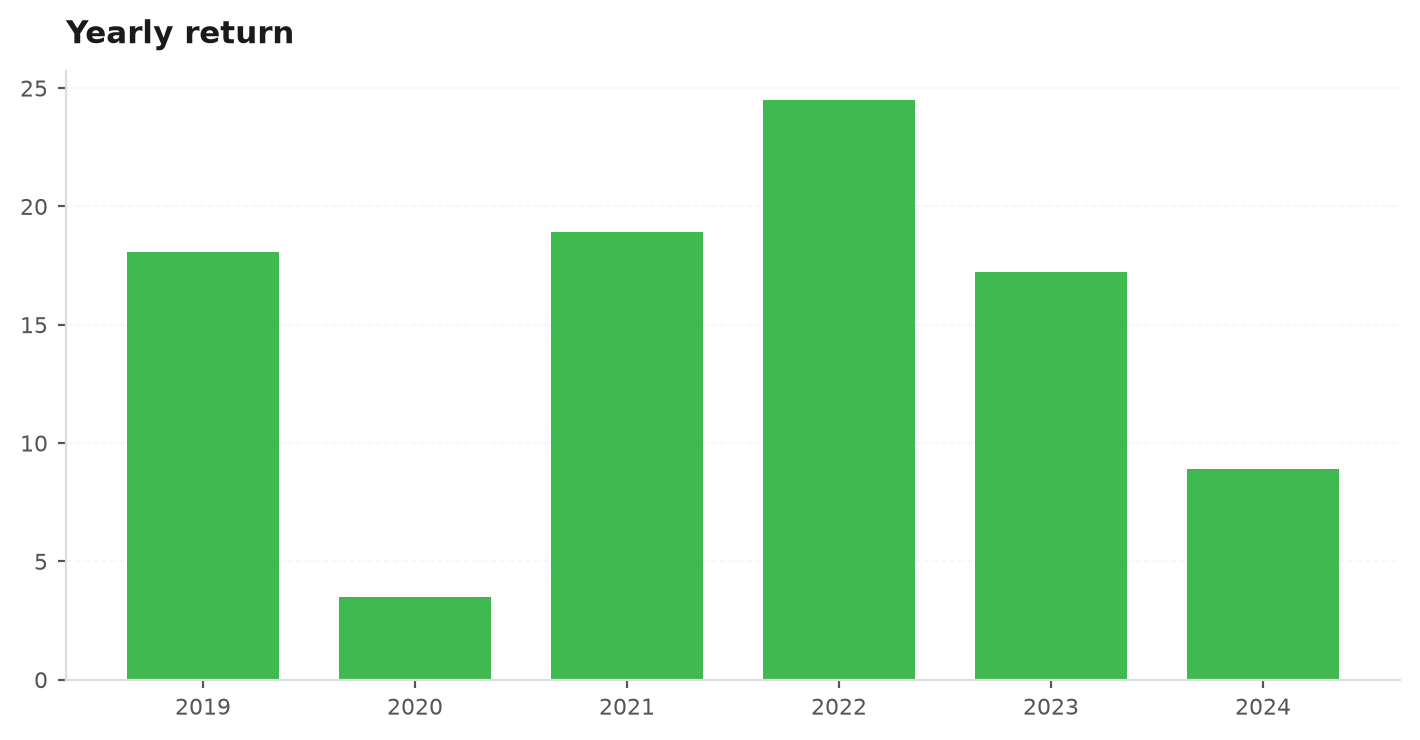
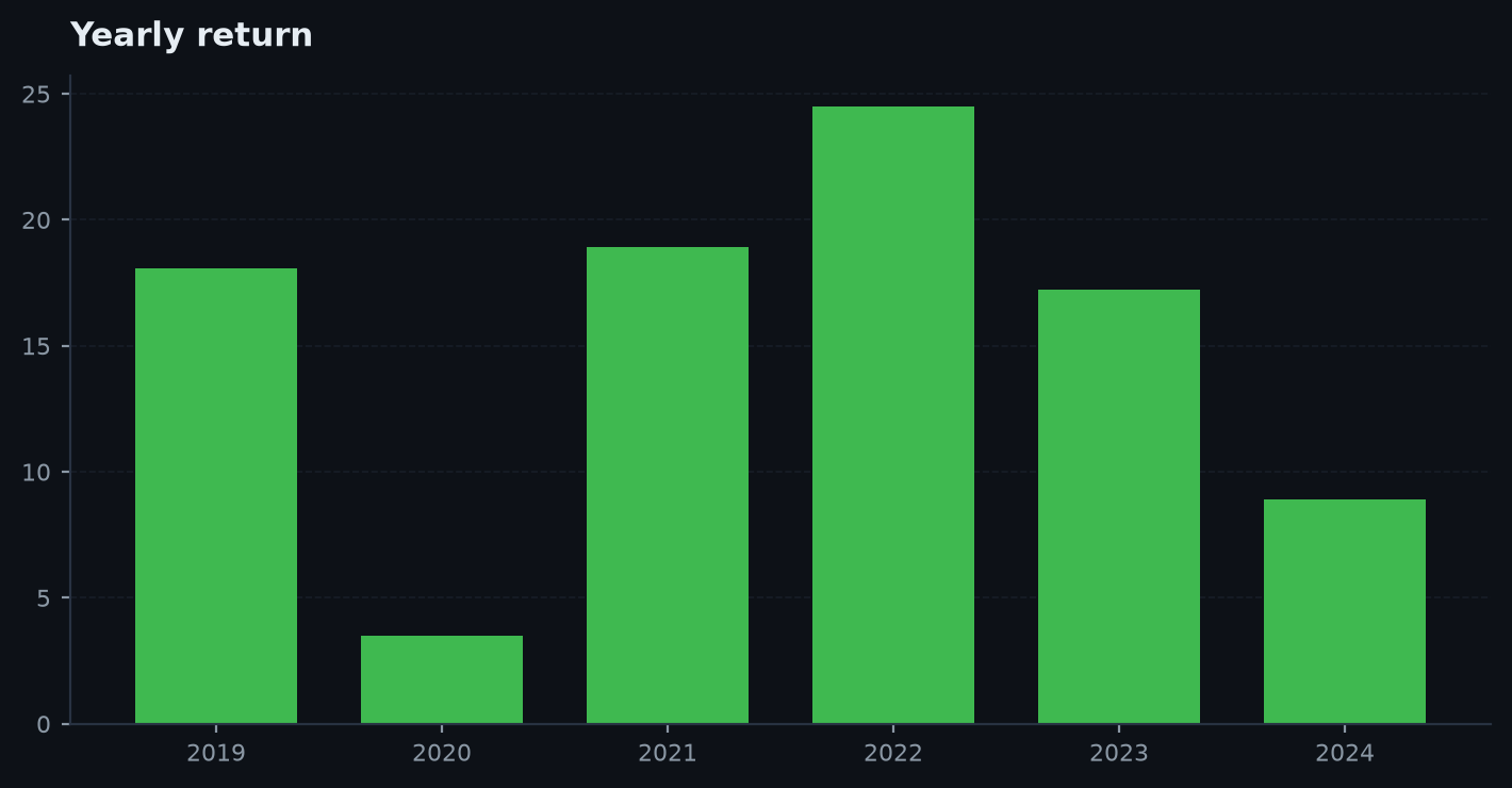
Analysis charts (axes-level)#
The diagnostic layer — each draws onto a supplied ax and returns it, so they compose into a grid just like the primitives above. They answer the questions the gauntlet asks: is the edge stable, fat-tailed, concentrated in one bucket, or cost-fragile?
rolling_metrics#
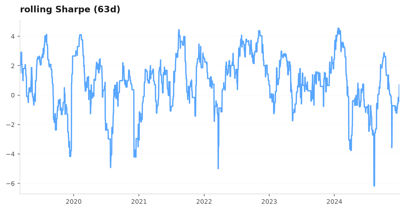
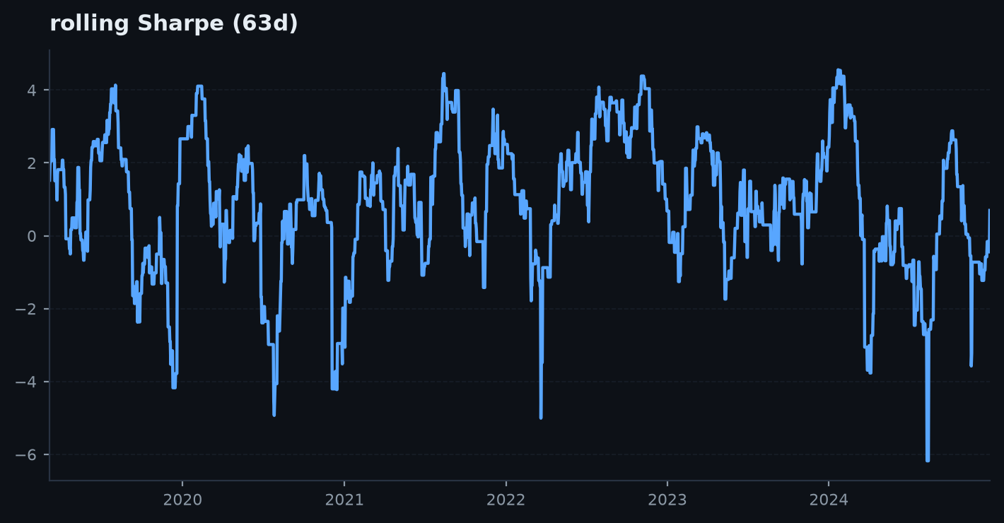
Rolling Sharpe / profit-factor / win-rate over a daily-R series — is the edge durable or fading? A flat-ish line is a durable edge; a curve that decays to zero after the design window is the classic overfit signature.
rolling_metrics(ax, daily_r, window: int = 63, metric: str = "sharpe")daily_r— a daily-R series (e.g. fromtrades_to_daily).window— rolling window in trading days (default63≈ one quarter).metric—"sharpe"(annualised, 252d),"pf"(gross win / gross loss, capped at 10, with a PF=1 line) or"win"(fraction of positive days, with a 0.5 line). Anything else raisesValueError.
return_distribution#
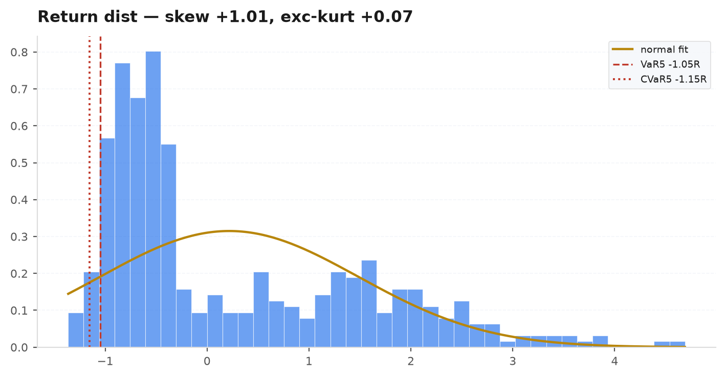
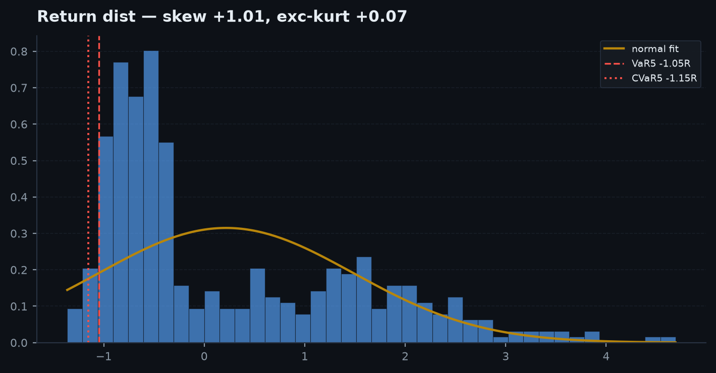
Histogram of per-trade R with a fitted-normal overlay plus 5% VaR / CVaR lines; skew and excess-kurtosis go in the title. The normal overlay makes the fat left tail obvious — a symmetric normal badly understates the tails of a trend edge.
return_distribution(ax, r, theme: str = "dark")r— per-trade R-multiples (non-finite values are dropped).theme— palette name for the fit / VaR colours ("dark"or"light").
trade_scatter#
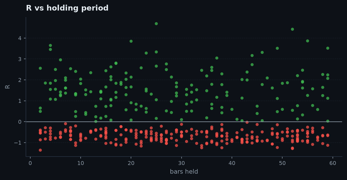
Per-trade R (y) vs holding period in bars (x), green wins / red losses. Reveals whether the edge lives in quick scalps or long holds, and whether losers cluster at a horizon. Uses r and bars_held (falls back to trade sequence if bars_held is absent).
trade_scatter(ax, trades: pd.DataFrame)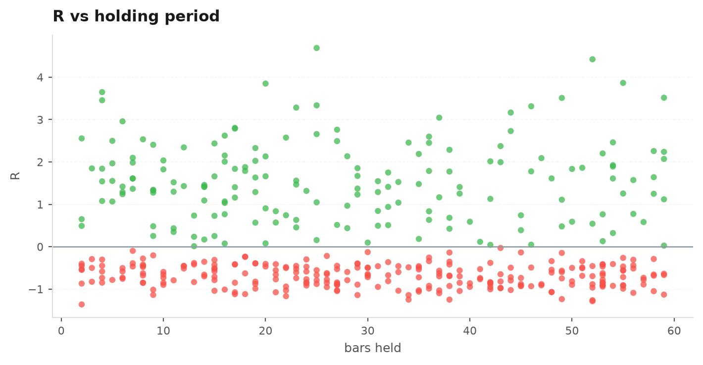
contribution_bars#
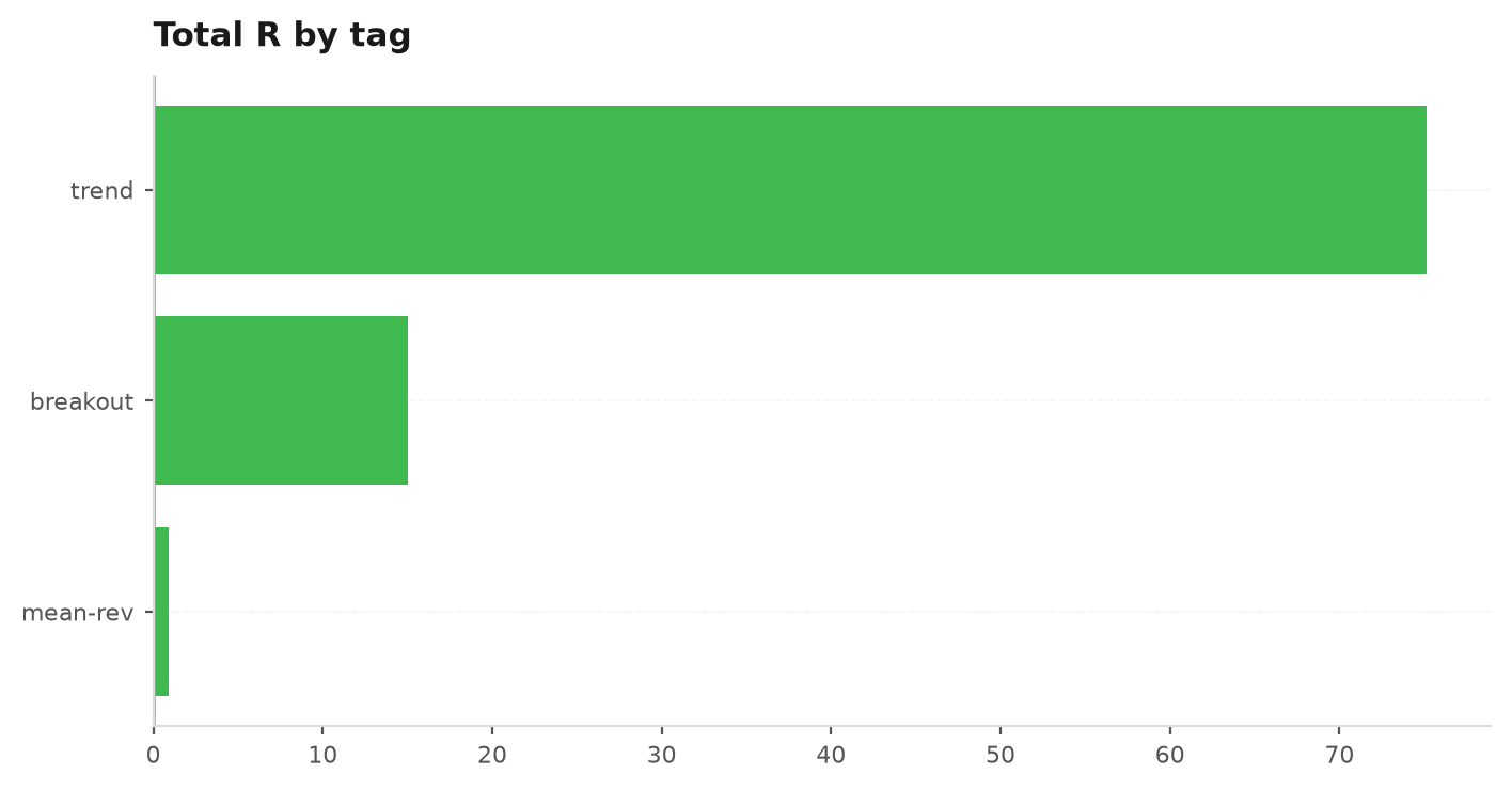
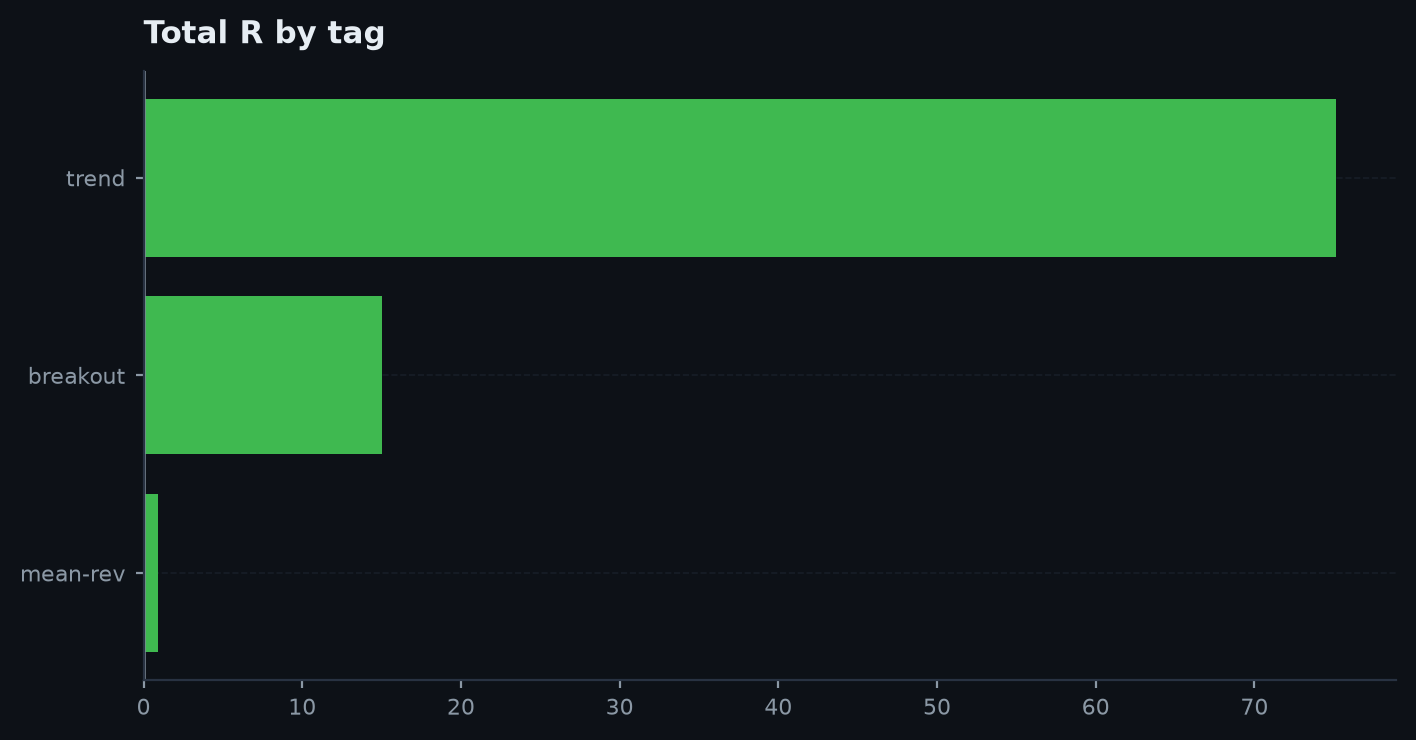
Total R grouped by a column, horizontal bars coloured green/red by sign — which sleeve / instrument / setup actually paid? A book leaning on one bucket is less robust than one whose P&L is spread. Falls back to a single all bucket if the column is missing.
contribution_bars(ax, trades: pd.DataFrame, by: str = "tag")by— the grouping column (default"tag").
seasonality#
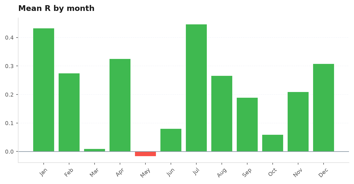
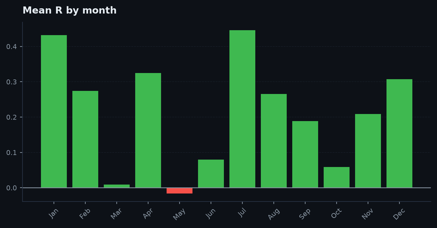
Mean R by calendar month (by="month") or weekday (by="dow"), green/red. A crude look for calendar effects — read sparse cells as colour, not signal.
seasonality(ax, trades: pd.DataFrame, by: str = "month")by—"month"(Jan–Dec) or"dow"(Mon–Sun).
qq_plot#
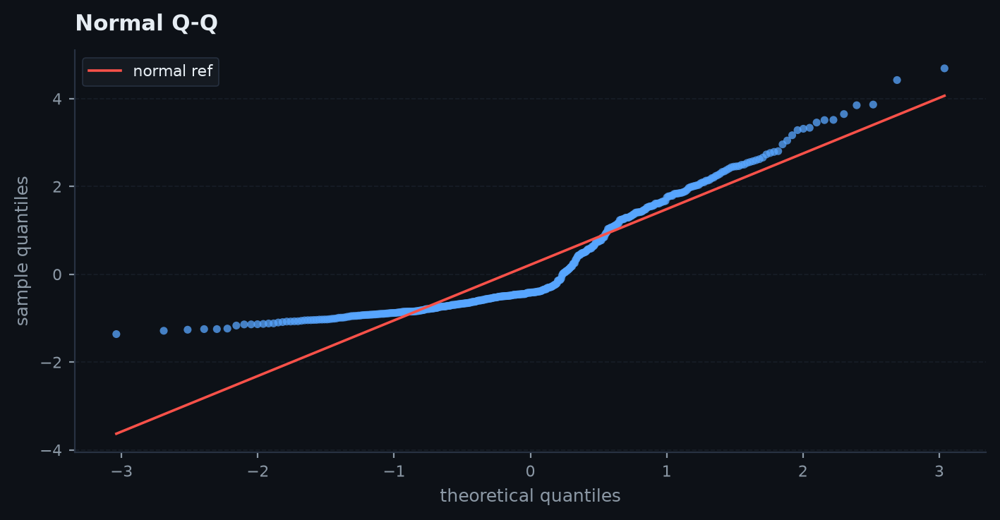
Sample quantiles vs standard-normal quantiles with a mean/std reference line. Points bowing below the line on the left = a fatter-than-normal loss tail. Uses the stdlib normal inverse-CDF (no scipy).
qq_plot(ax, r)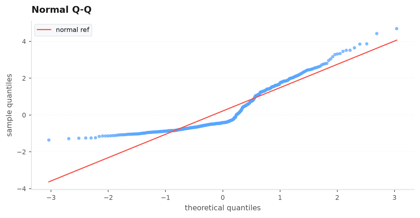
cost_sensitivity#
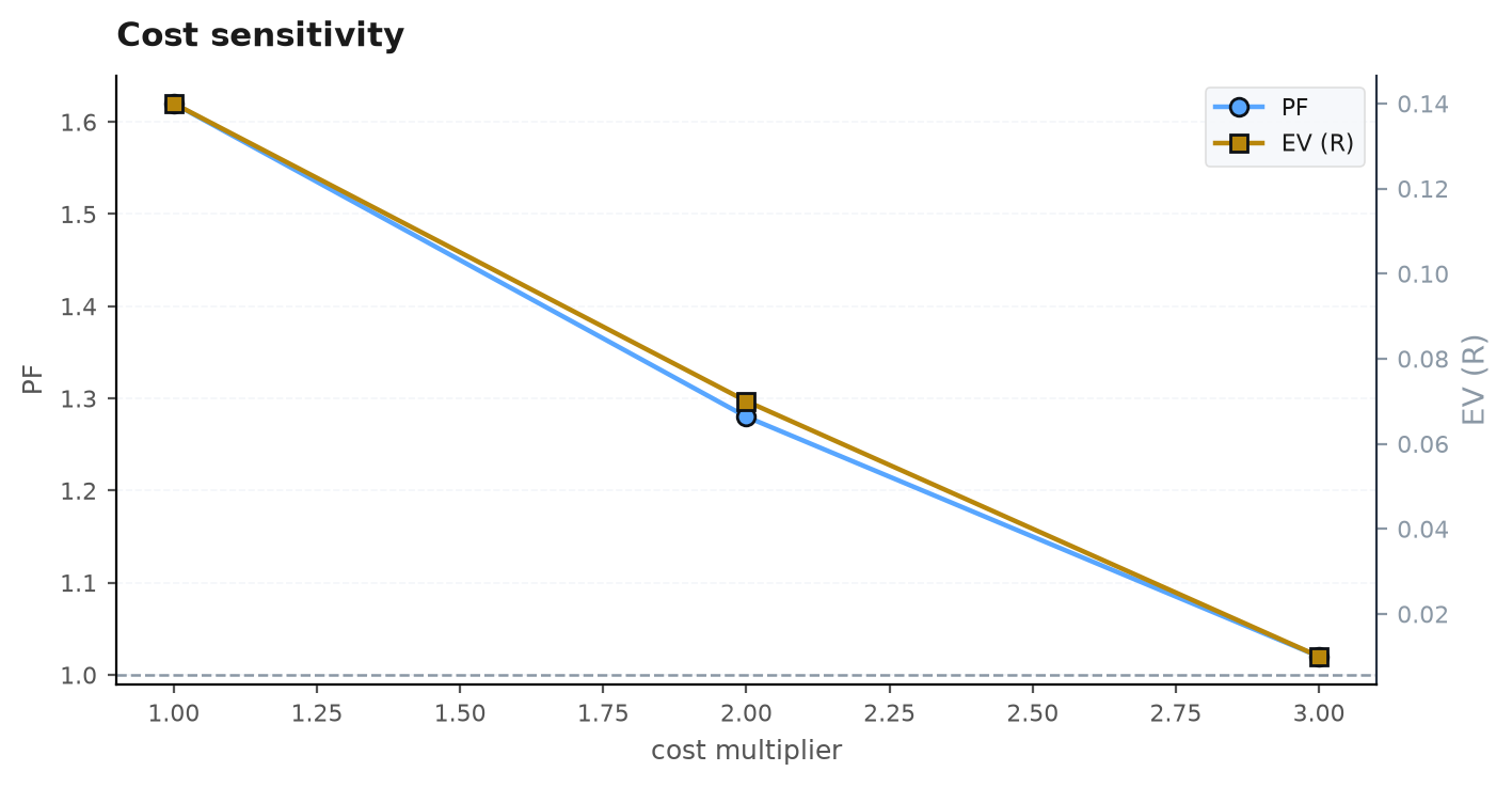
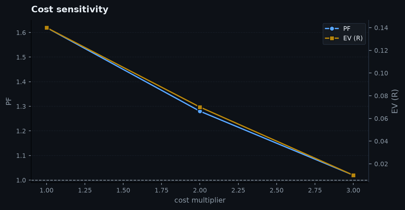
Profit factor (left axis) and EV-R (right axis) vs cost multiplier — the cost-stress picture, with the PF=1 breakeven line. A real edge degrades gracefully and holds PF>1 at 2–3x; a fake one collapses.
cost_sensitivity(ax, stress: dict)stress— exactly whatedgekit.costs.cost_stressreturns fedtrade_stats:{mult: {"pf": .., "ev_r": ..}}.
regime_bars#
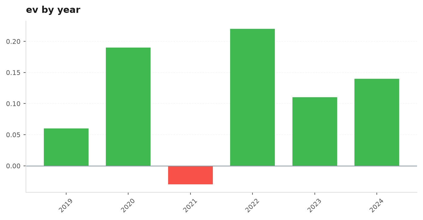
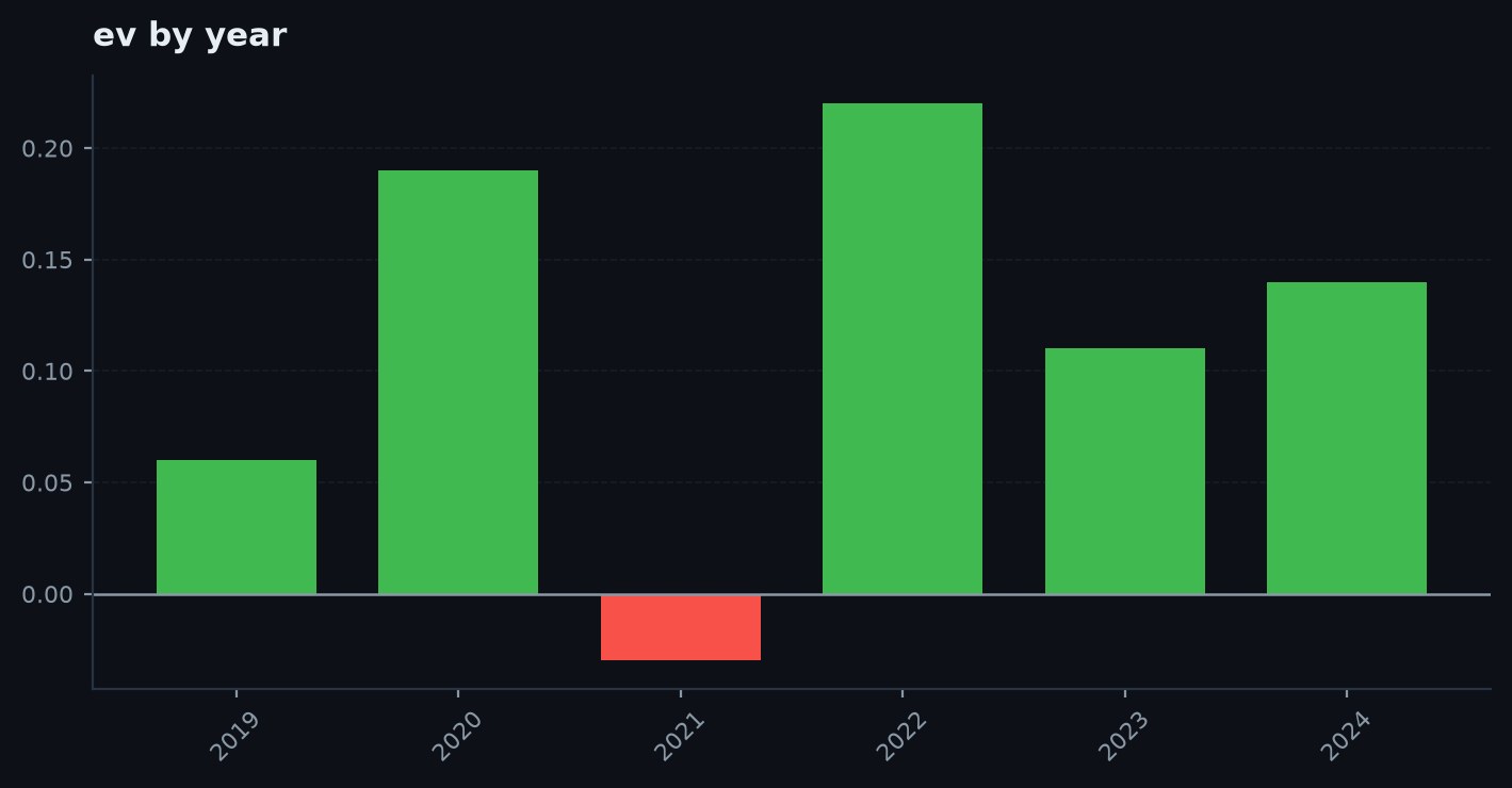
Bar a chosen metric per year, green/red — is the edge spread across regimes? One-good-year edges are fragile.
regime_bars(ax, regime_df, metric: str = "ev_r")regime_df— whatedgekit.validation.regime_by_yearreturns (index=year, columnsn/ev/win/pf/total_r).metric— a column name or an_ralias ("ev_r"→ev,"total_r"→total_r); falls back to the first column.
plt = viz._plt()
daily = viz.trades_to_daily(trades)

fig, axes = plt.subplots(2, 3, figsize=(15, 8))
viz.rolling_metrics(axes[0, 0], daily, window=63, metric="sharpe")
viz.return_distribution(axes[0, 1], trades["r"], theme="dark")
viz.qq_plot(axes[0, 2], trades["r"])
viz.trade_scatter(axes[1, 0], trades)          # needs a bars_held column
viz.contribution_bars(axes[1, 1], trades, by="tag")
viz.seasonality(axes[1, 2], trades, by="month")

# cost-stress + per-year regime, from the validation layer
stress = ek.costs.cost_stress(trades["r"].to_numpy(), mults=(1, 2, 3))
fig2, (a, b) = plt.subplots(1, 2, figsize=(12, 4))
viz.cost_sensitivity(a, stress)
viz.regime_bars(b, ek.validation.regime_by_year(trades), metric="ev_r")
Figure-level charts#
Each returns a matplotlib Figure ready for fig_to_base64 or a report's .chart().
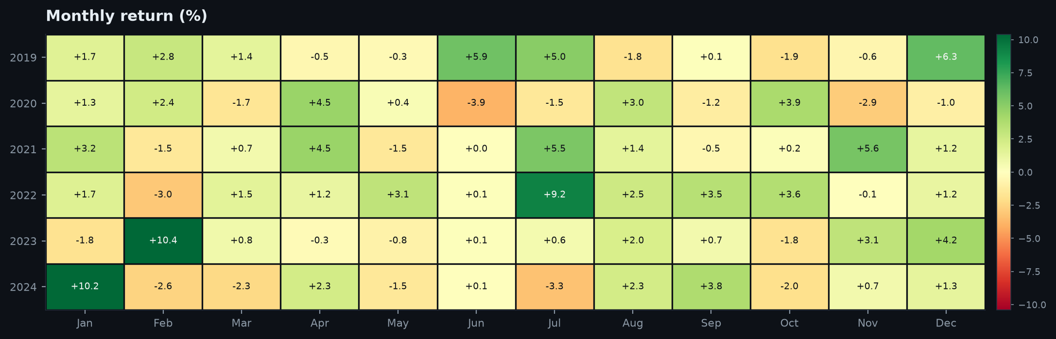
monthly_heatmap(monthly_returns, theme: str = "dark", title: str = "Monthly return")
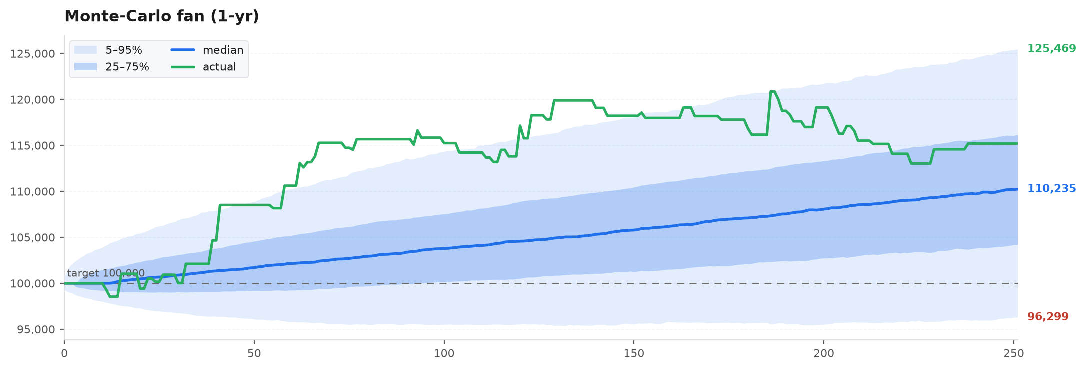
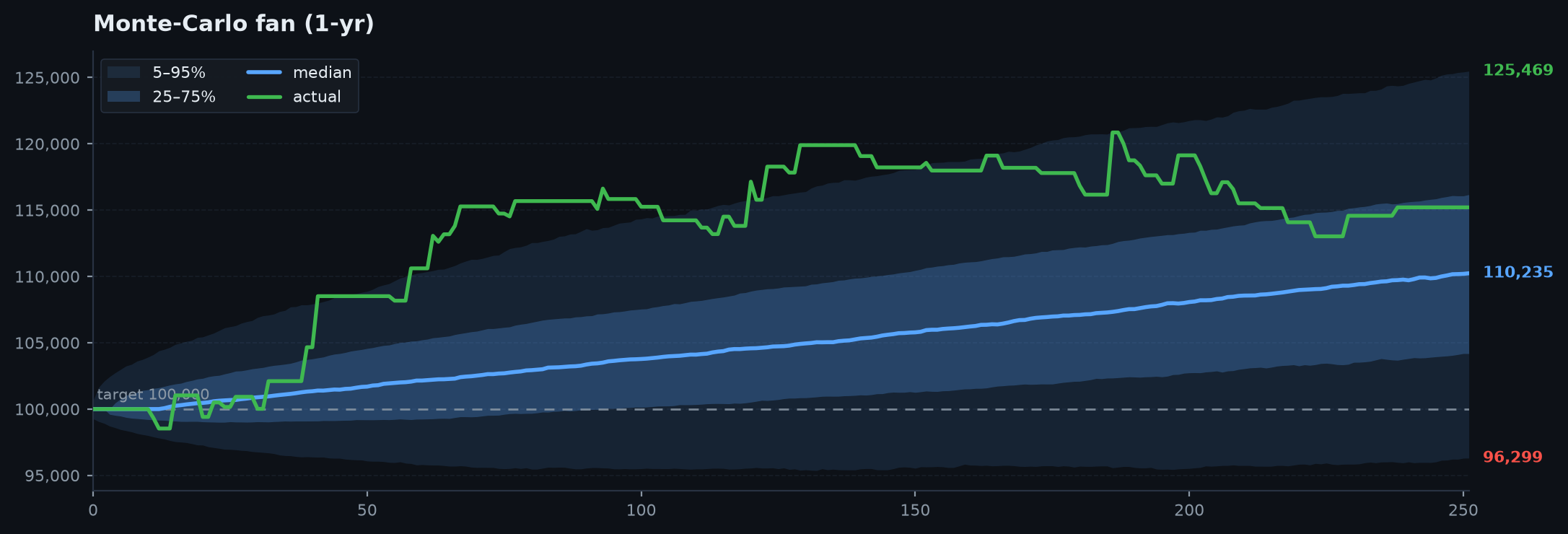
mc_fan(paths, actual=None, theme: str = "dark", title: str = "Monte-Carlo fan")
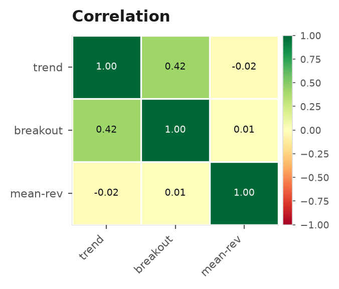
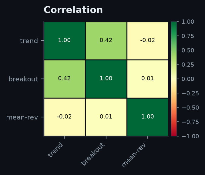
corr_heatmap(corr, theme: str = "dark", title: str = "Correlation")monthly_heatmap— year × month RdYlGn heatmap (accepts a Series indexed by month).mc_fan— percentile fan (5/25/50/75/95 bands + median) of an(n_sims, horizon)paths array; overlays a 1-Dactualpath if given.corr_heatmap— correlation-matrix heatmap from a square DataFrame.
fig = viz.monthly_heatmap(viz.trades_to_monthly(trades), theme="dark")

# forward Monte-Carlo fan from block_bootstrap paths
import numpy as np
paths = np.cumsum(np.random.default_rng(1).standard_normal((2000, 252)), axis=1)
fig = viz.mc_fan(paths, actual=paths[0], title="Forward equity — 1y")

corr = portfolio.correlation({"trend": r_trend, "breakout": r_breakout})
fig = viz.corr_heatmap(corr)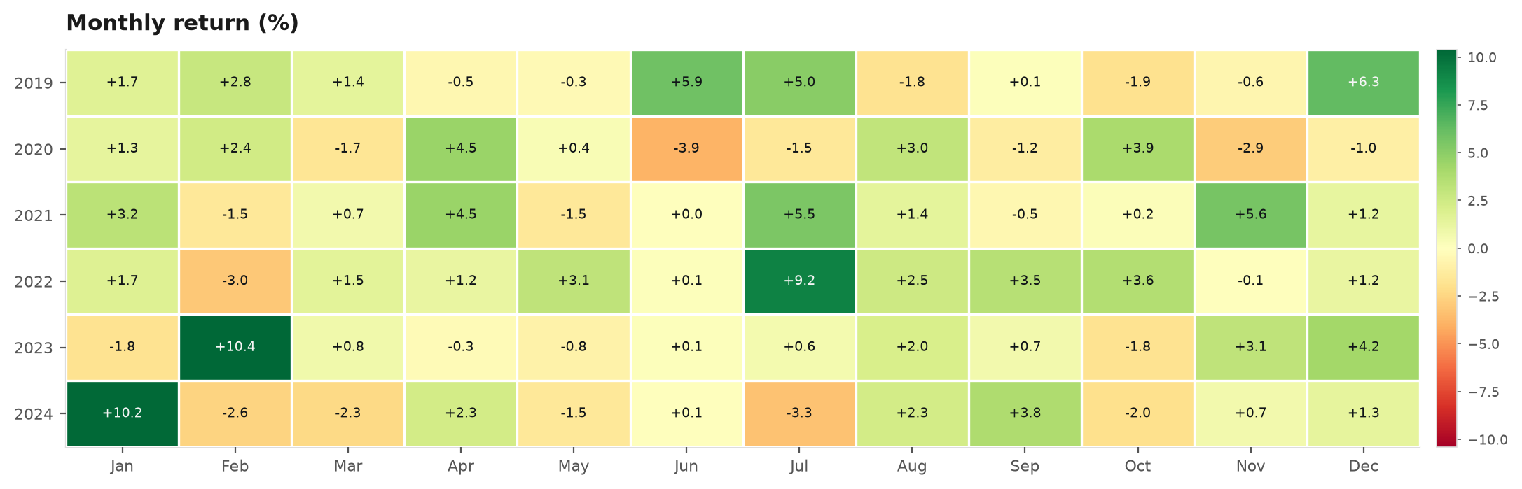
Tear-sheet panels (figure-level)#
The larger composed figures a full report leans on. Each returns a themed Figure ready for fig_to_base64, save_png, or a report's .chart().
equity_with_drawdown#
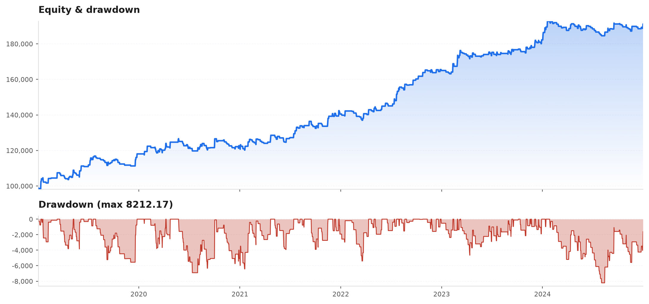
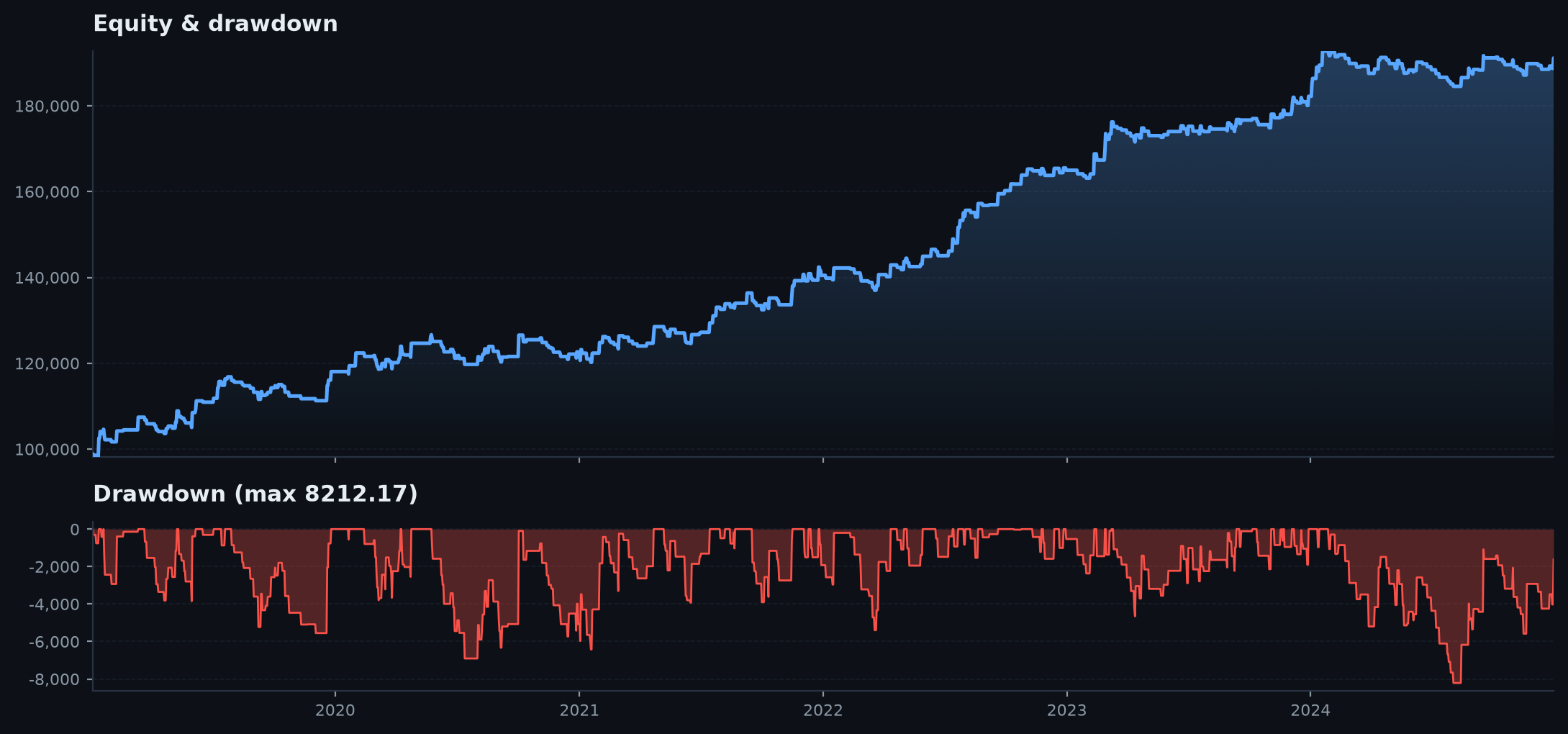
Two stacked shared-x panels: equity curve on top, underwater drawdown below — the single most-read backtest picture, so the pain reads at the same x as the gains.
equity_with_drawdown(eq, theme: str = "dark", title: str = "Equity")eq— a cumulative level series (cumsum R, or dollars).theme/title— palette name and the top-panel title.
allocation_area#
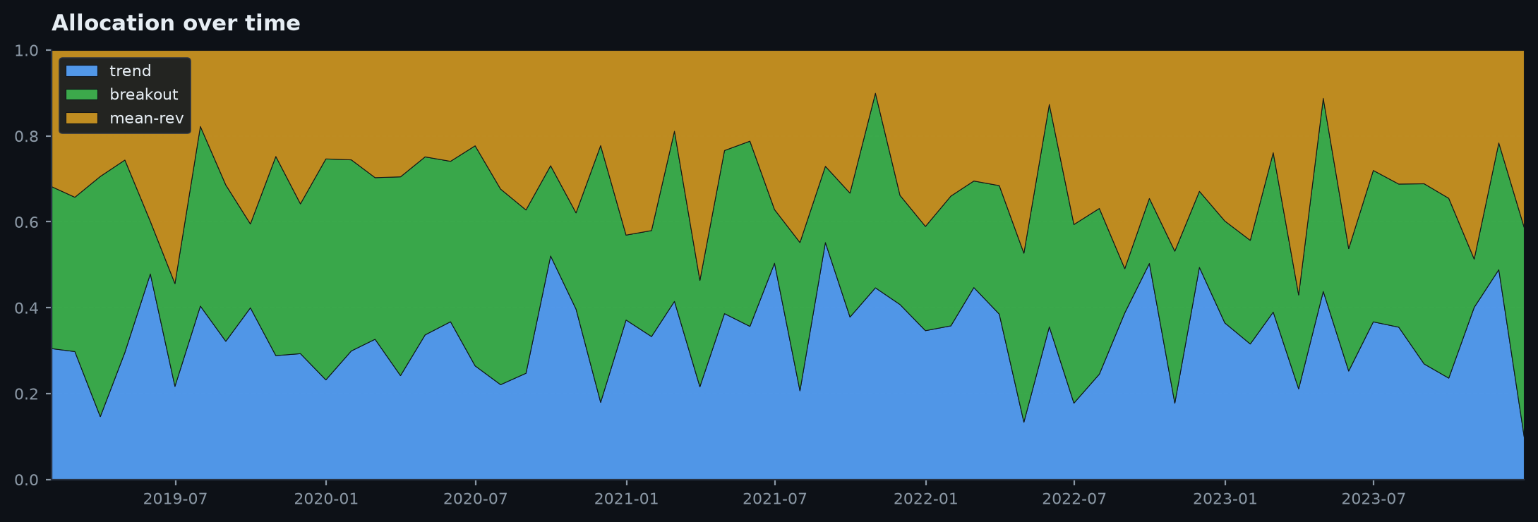
Stacked area of a weights DataFrame (rows=time, cols=assets) over time — how the book's capital shifts across sleeves through the sample. Columns stack in frame order and the legend names the assets.
allocation_area(weights, theme: str = "dark", title: str = "Allocation")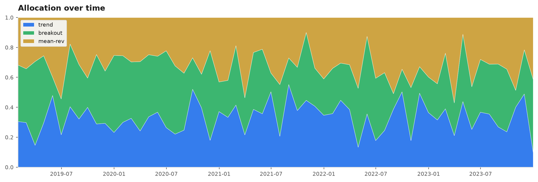
rolling_correlation#
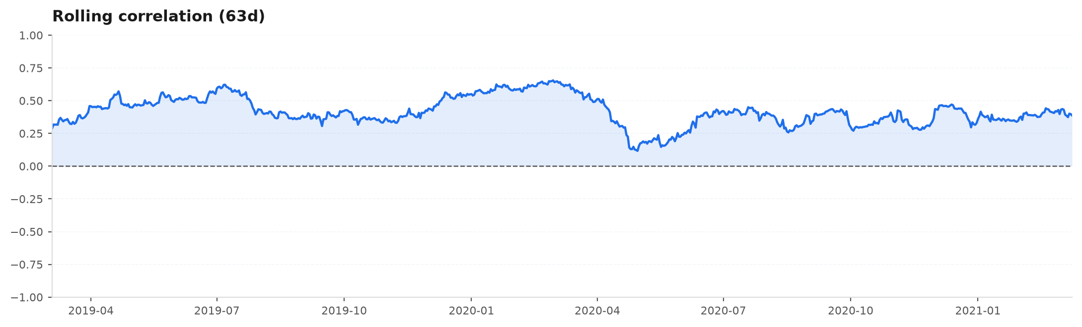
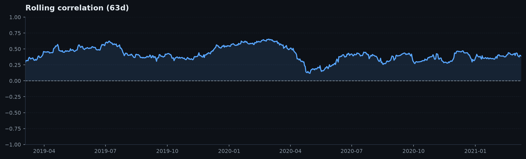
Rolling correlation of two daily-R series — a diversification check. Two books that look uncorrelated on average can lock together in a crisis. Aligns on the shared index before rolling; the zero line is drawn and the y-axis clamped to [-1, 1].
rolling_correlation(book_a, book_b, window: int = 63, theme: str = "dark")book_a/book_b— two daily-R series.window— rolling window in days (default63).
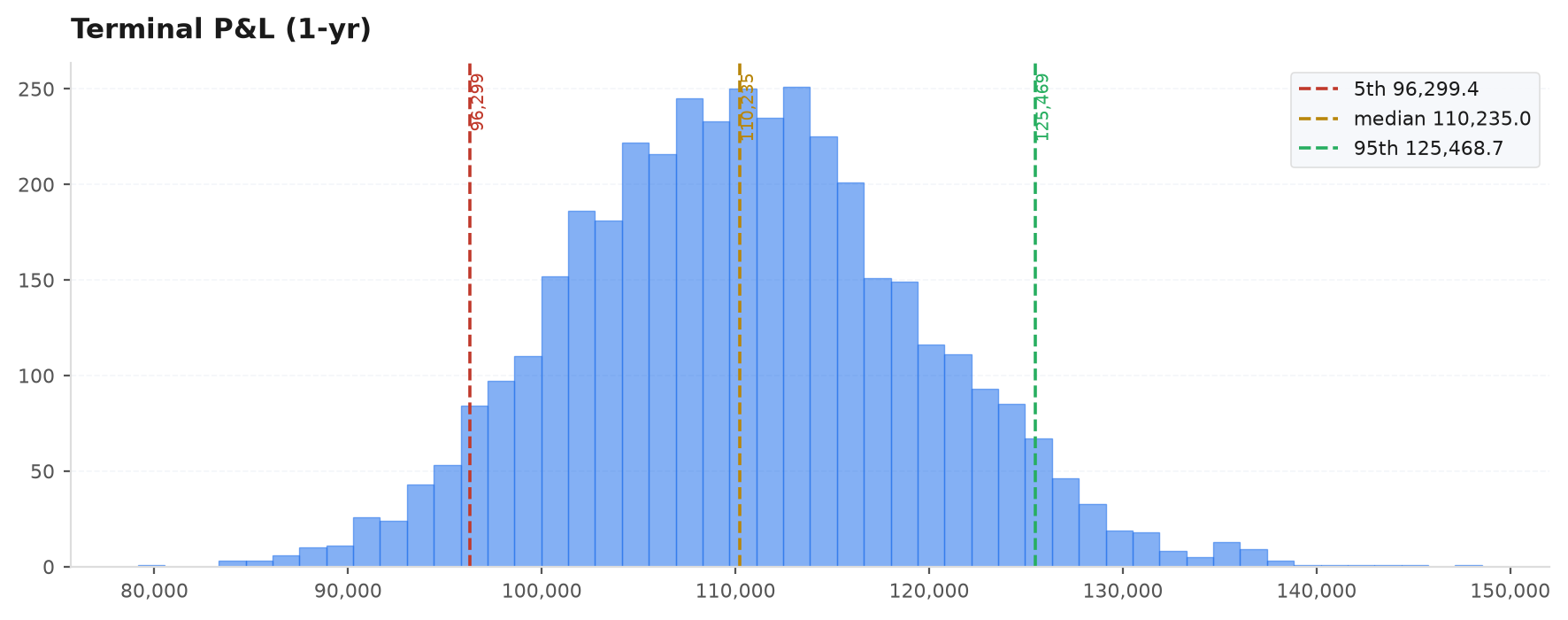
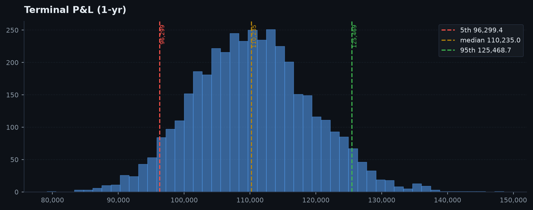
mc_terminal_hist#
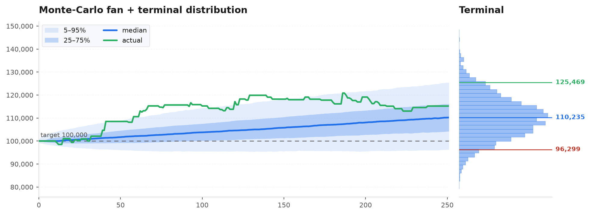
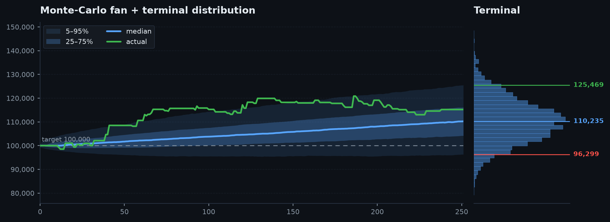
Histogram of Monte-Carlo terminal outcomes with 5th / median / 95th lines. Plan around the 5th, not the median.
mc_terminal_hist(paths_or_terminal, theme: str = "dark", title: str = "Terminal P&L")paths_or_terminal— an(n_sims, horizon)paths array (terminals = last column) OR a 1-D array of terminal values.
permutation_hist#
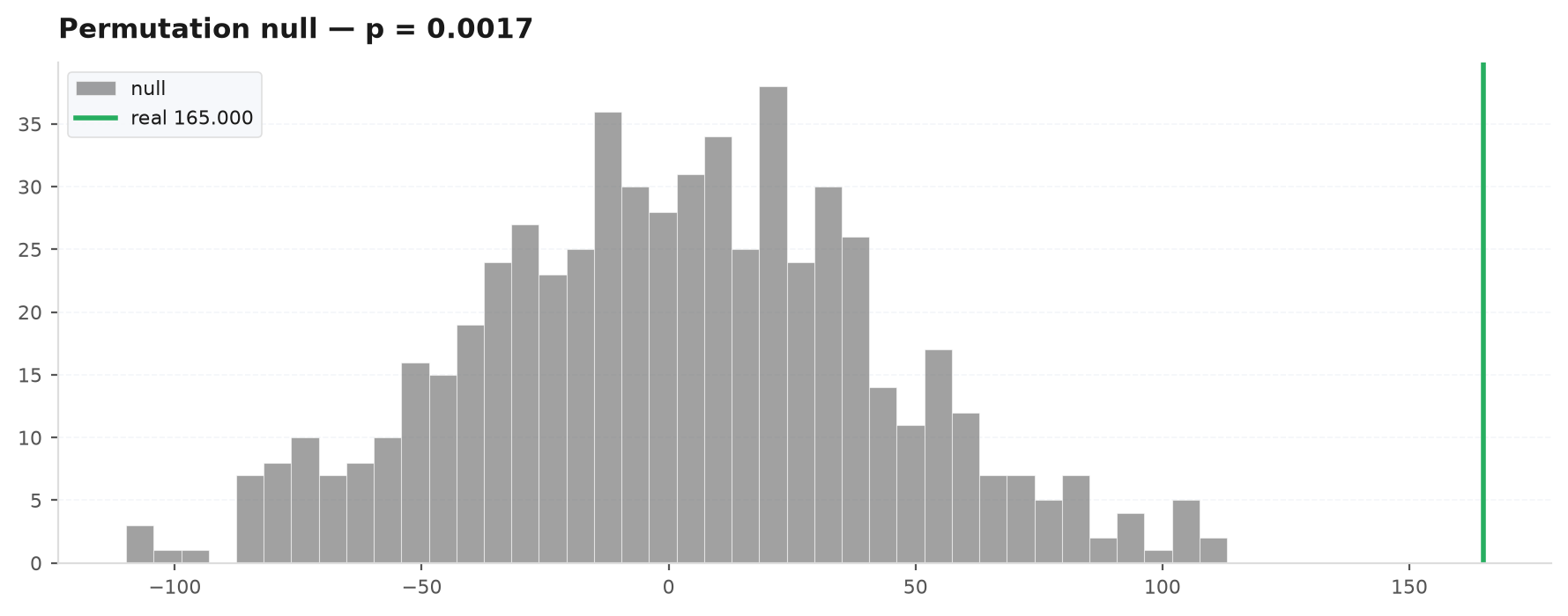
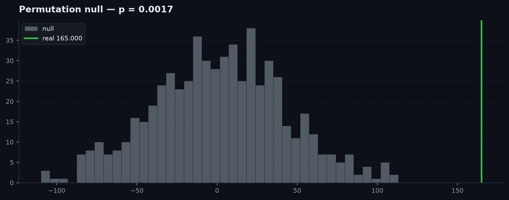
Null-distribution histogram with the real stat drawn as a line plus the p-value in the title — the Masters permutation picture, p = (#{null >= real} + 1) / (N + 1). A real stat deep in the right tail (p<0.01) is unlikely to be luck; one inside the null cloud is noise.
permutation_hist(null_stats, real_stat, theme: str = "dark", title: str = "Permutation null")null_stats— the array of statistics from the permuted (label-shuffled) runs.real_stat— the observed statistic on the true labels.
daily = viz.trades_to_daily(trades)

fig1 = viz.equity_with_drawdown(daily.cumsum(), theme="dark", title="Cumulative R")

# diversification: this book vs another daily-R series
fig2 = viz.rolling_correlation(daily, other_daily, window=63)

# visualise the gauntlet
mc = ek.validation.block_bootstrap_mc(daily.to_numpy(), horizon=252, n=5000)
fig3 = viz.mc_terminal_hist(mc["terminal"], title="1-yr terminal R")

perm = ek.validation.mcpt(trades["r"].to_numpy(), n=1000)
fig4 = viz.permutation_hist(perm["null"], perm["stat"], title="Permutation null (EV-R)")

# capital mix over time
fig5 = viz.allocation_area(weights_df)
See also#
- edgekit.report — embed these figures in a self-contained HTML page.
- edgekit.validation —
block_bootstrap_mcproduces the pathsmc_fanplots. - edgekit.portfolio —
correlationfeedscorr_heatmap.