edgekit

Chart gallery

Every chart edgekit.vizproduces, rendered in both themes. Toggle light/dark (top-right) and the charts follow. Each is one function call on a backtest's trades or equity — and they compose into the one-call tear_sheet.

Monte-Carlo, front and center#

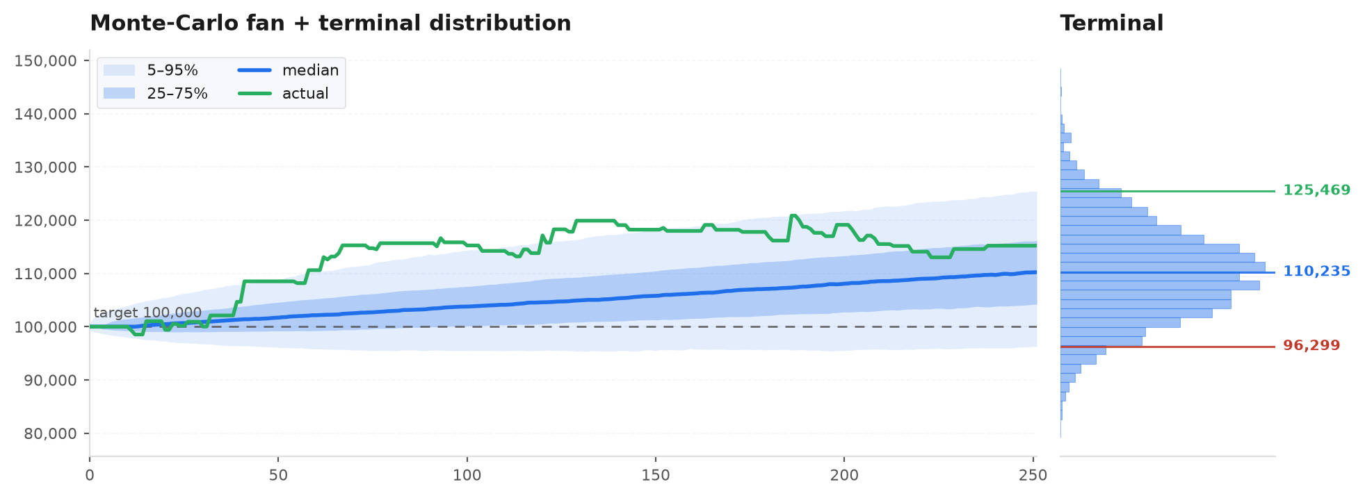
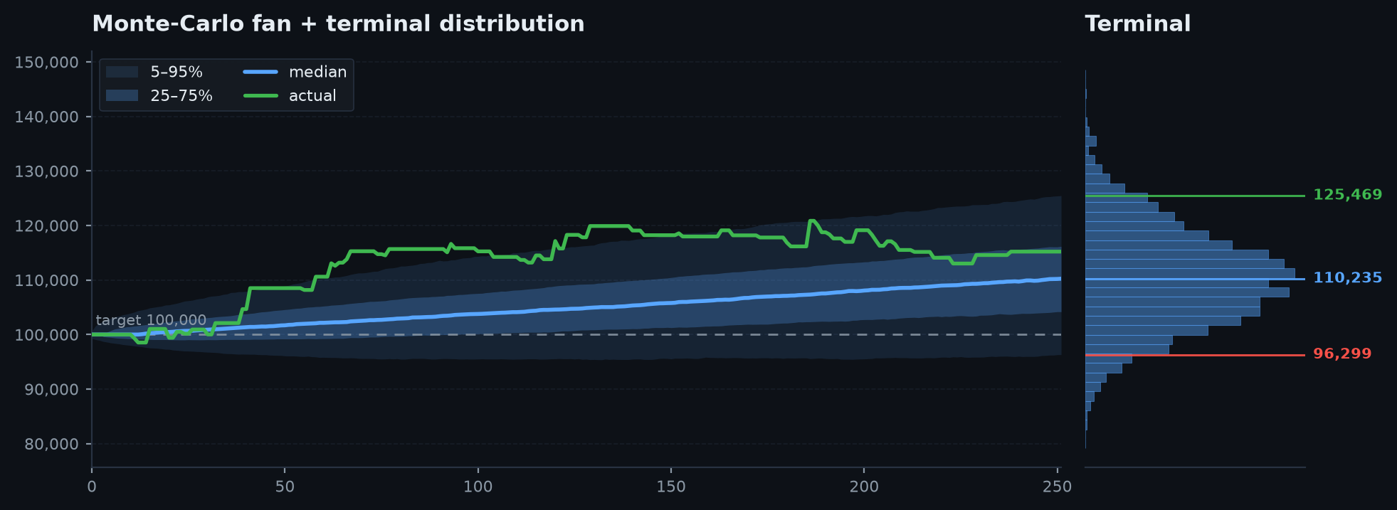
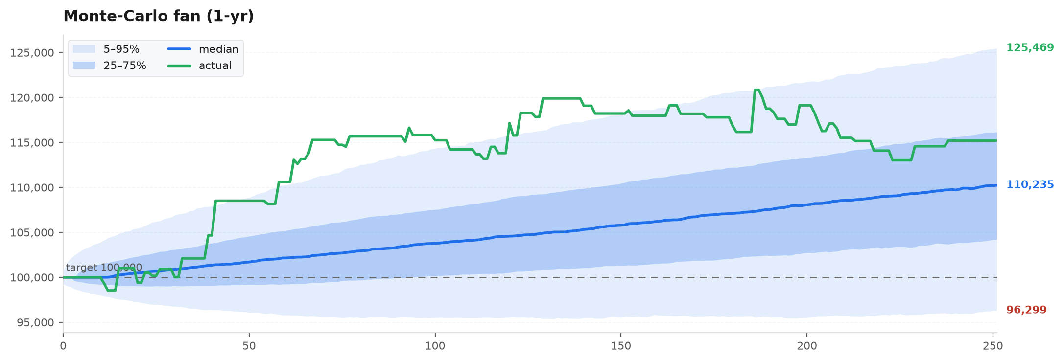
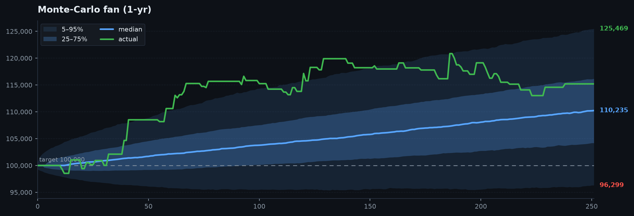
The fan is the honest forward picture: bootstrap the daily returns thousands of times and plot the percentile cone. edgekit annotates the terminal 5th / median / 95th outcomes, overlays the realised path, and can append a marginal distribution of where a year of paths lands.

Monte-Carlo fan
The cone of uncertainty: 5/25/50/75/95 percentile bands with the terminal values annotated.
# bootstrap a year of daily P&L into forward equity paths
paths = account + np.cumsum(rng.choice(daily_pnl, size=(5000, 252)), axis=1)
fig = ek.viz.mc_fan(paths, actual=equity, target=account)
Fan + terminal distribution
Fan + terminal distribution — The same fan with a marginal histogram of terminal outcomes — the professional tear-sheet view.
Terminal P&L distribution
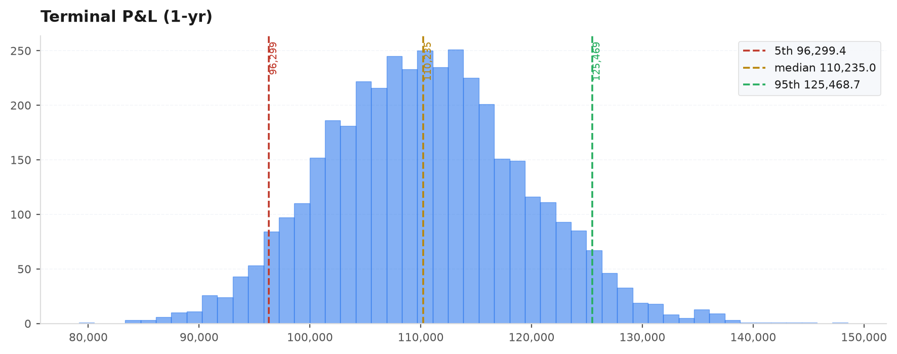
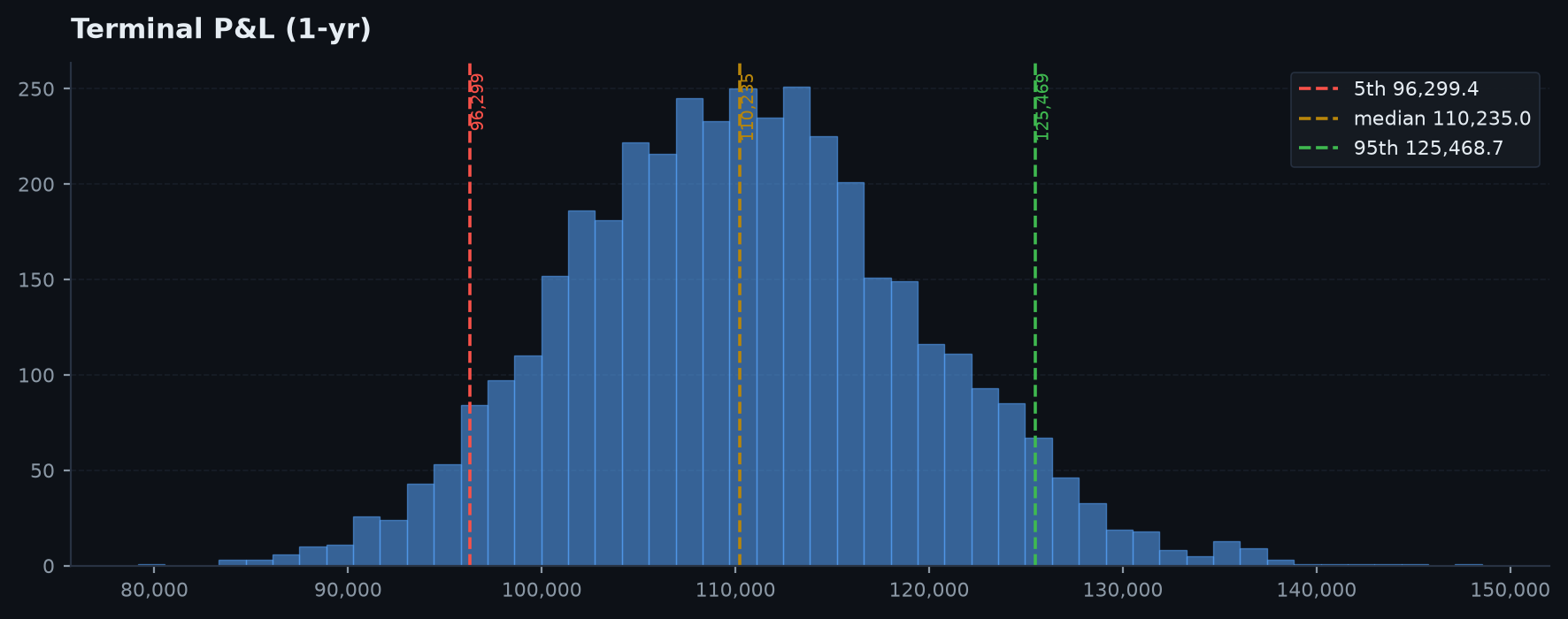
Terminal P&L distribution — Where a year of paths lands, with the 5th / median / 95th percentiles marked.
Reproduce these
All of these are generated by examples/gen_gallery.py from a seeded synthetic backtest — no real strategy involved. Run it to regenerate the whole gallery.
Performance#

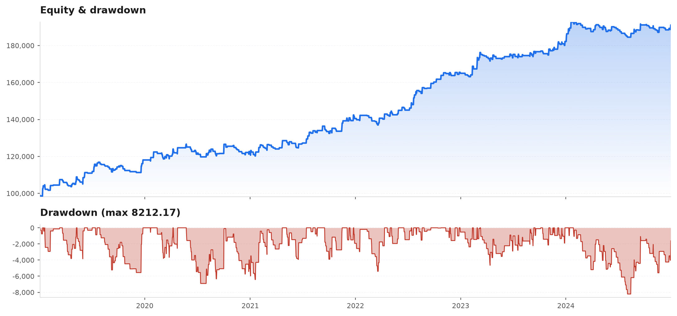
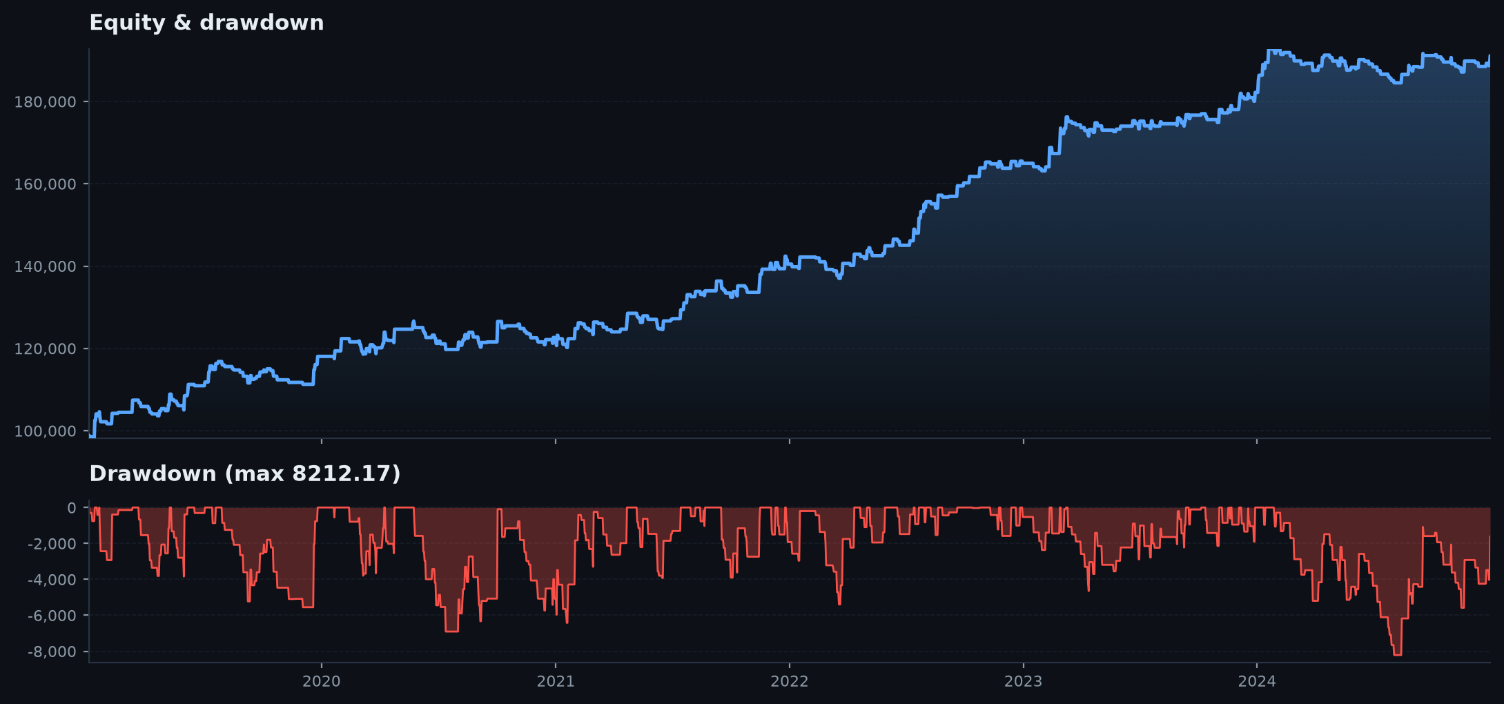
Equity + drawdown
Equity + drawdown — Equity on top, underwater drawdown below — the top panel of every tear sheet.
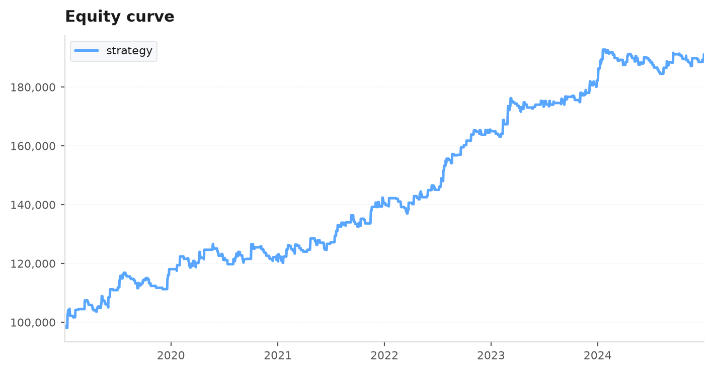
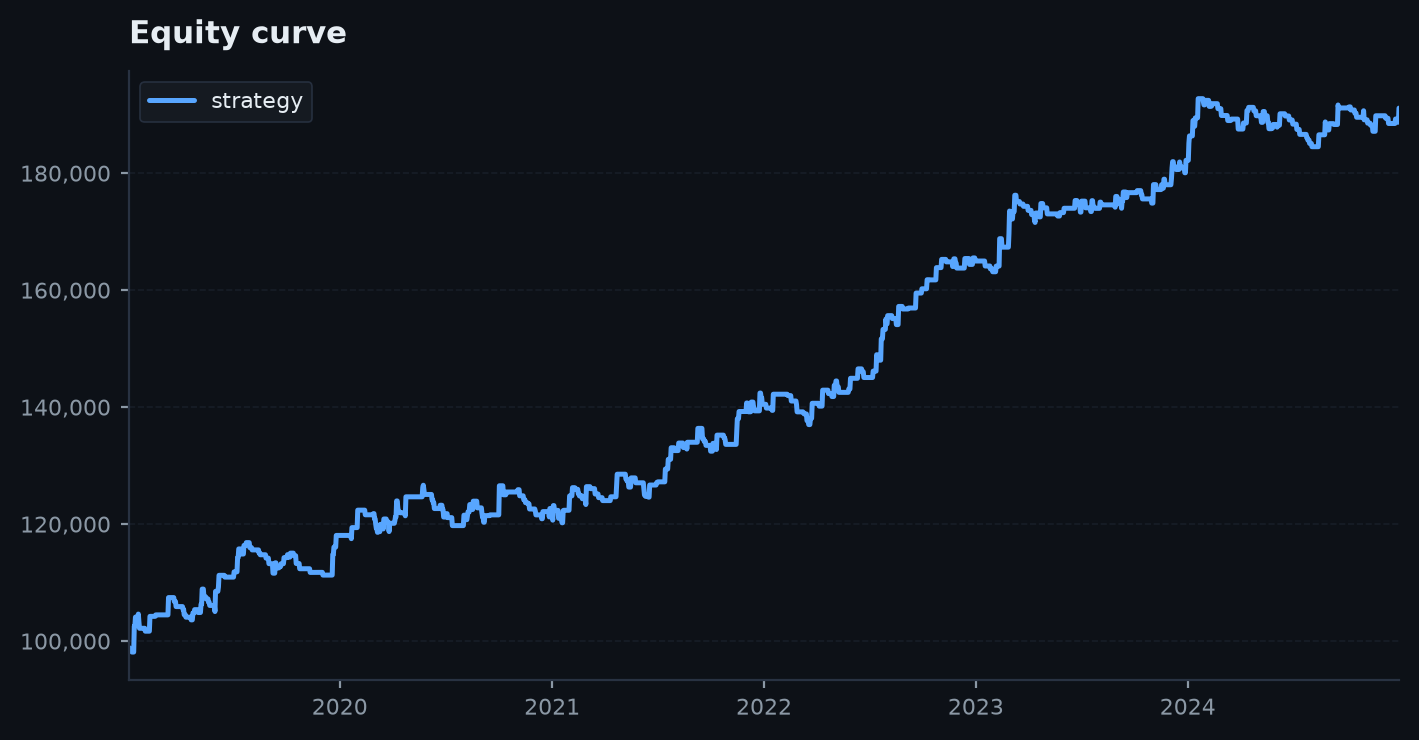
Equity curve
Equity curve — A single cumulative equity line.
Underwater drawdown
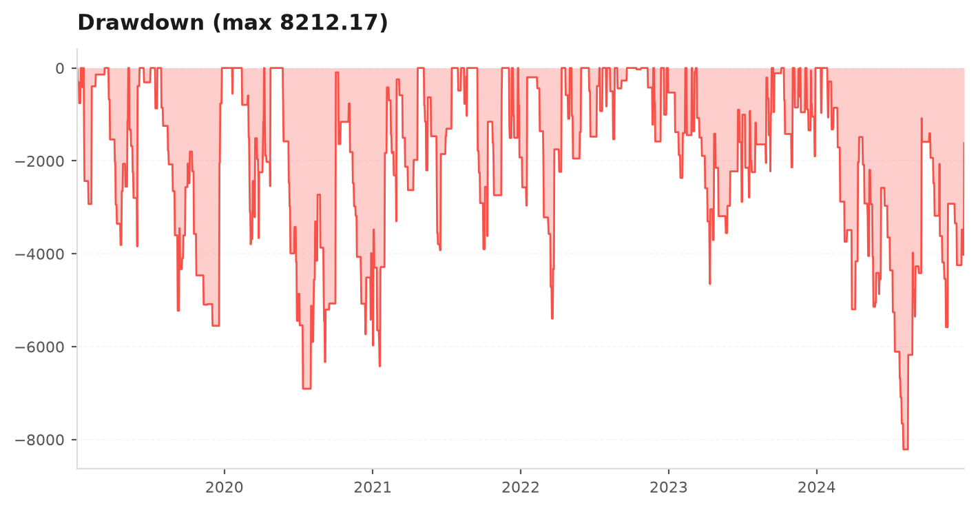
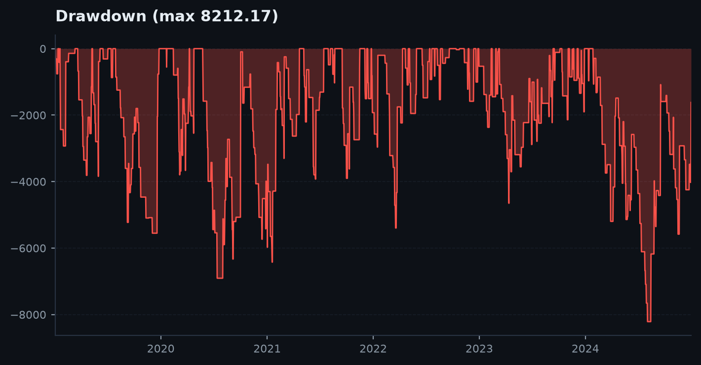
Underwater drawdown — Peak-to-trough drawdown shaded, with an optional cap line.
Monthly P&L
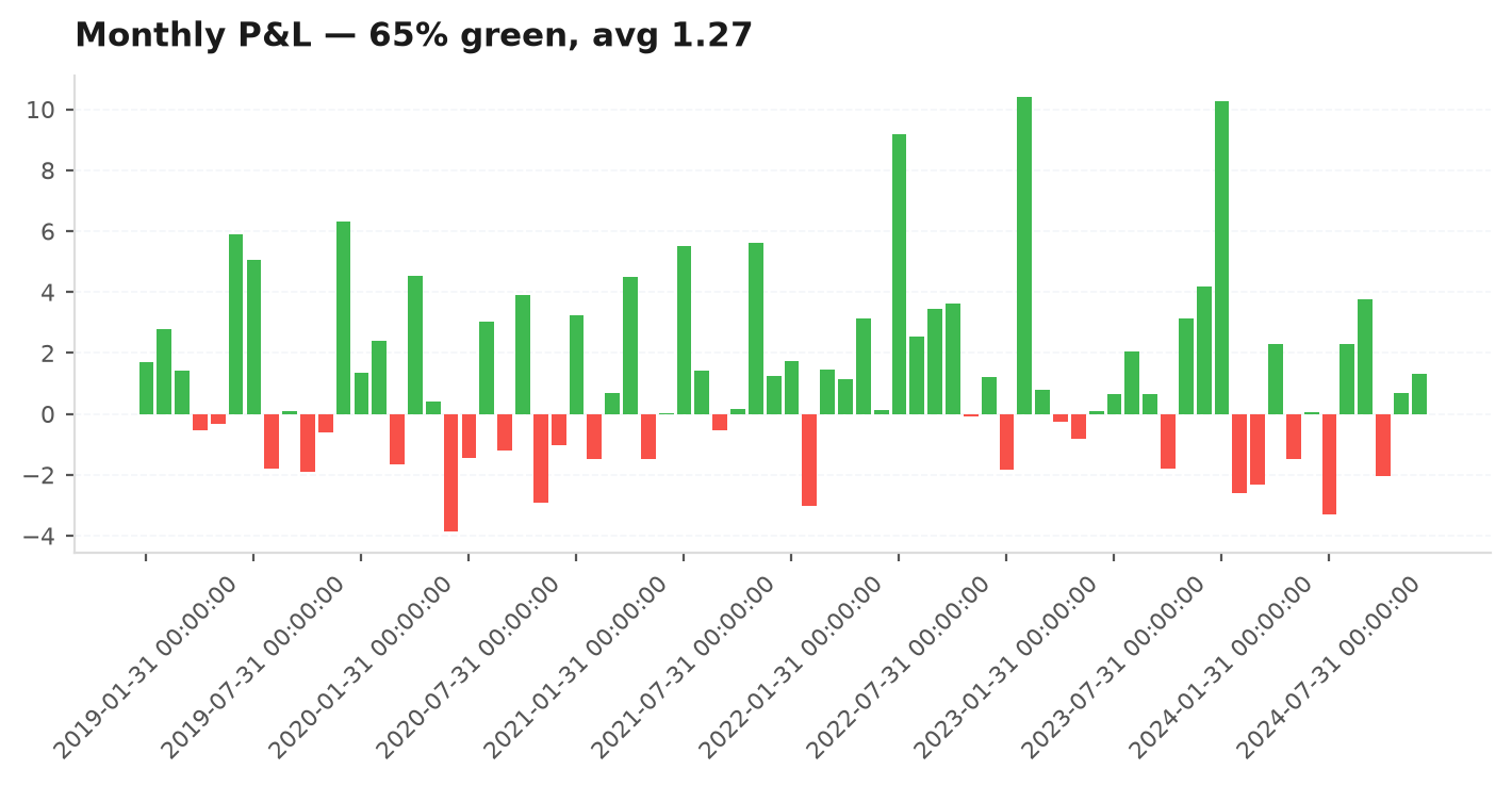
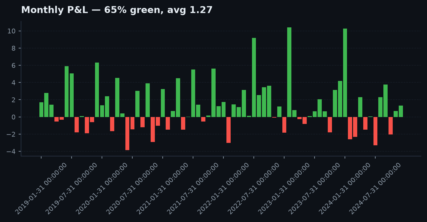
Monthly P&L — Green/red bars per month with the share of green months in the title.
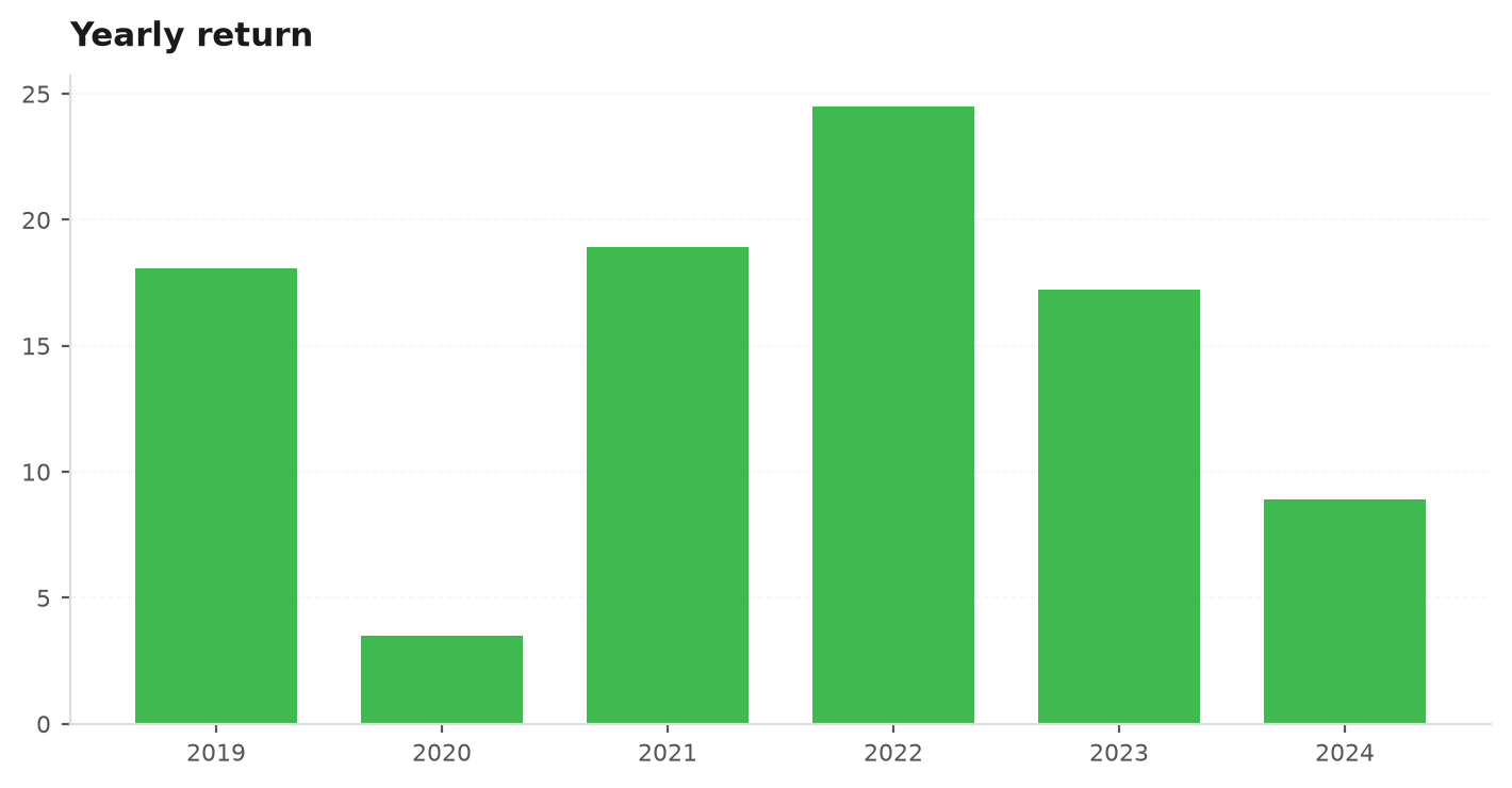
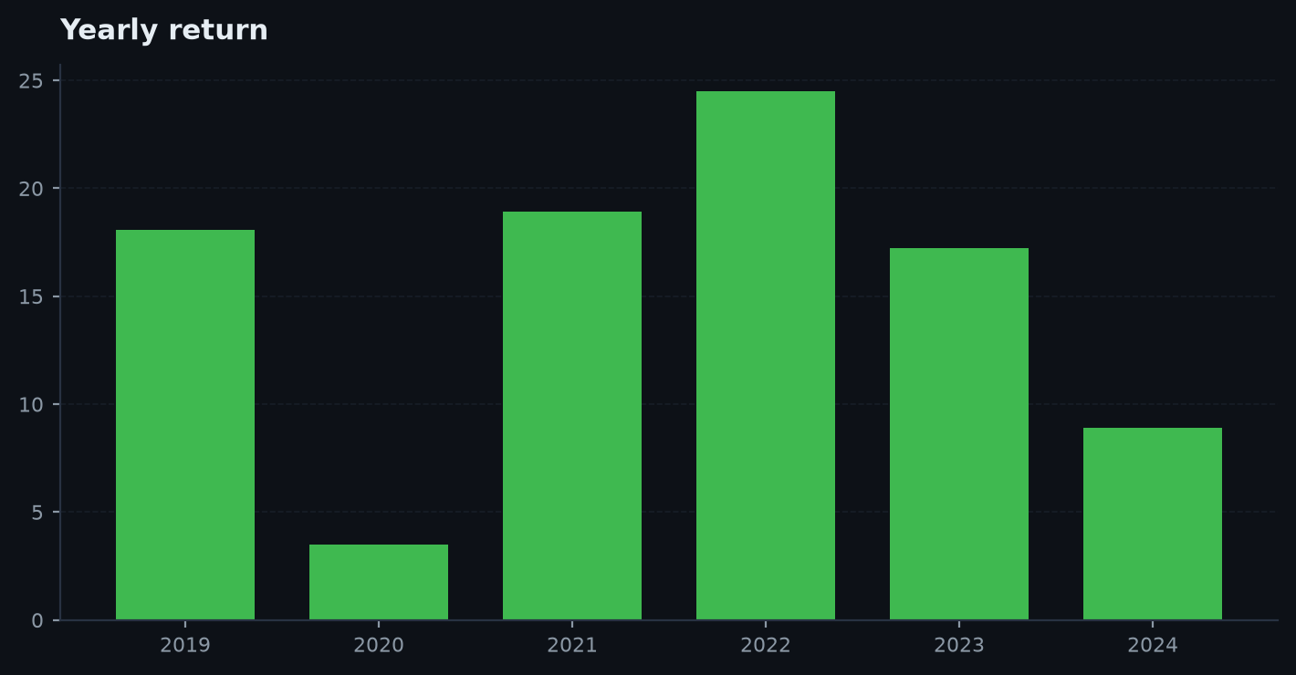
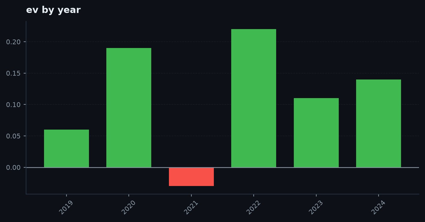
Yearly returns
Yearly returns — One bar per calendar year.
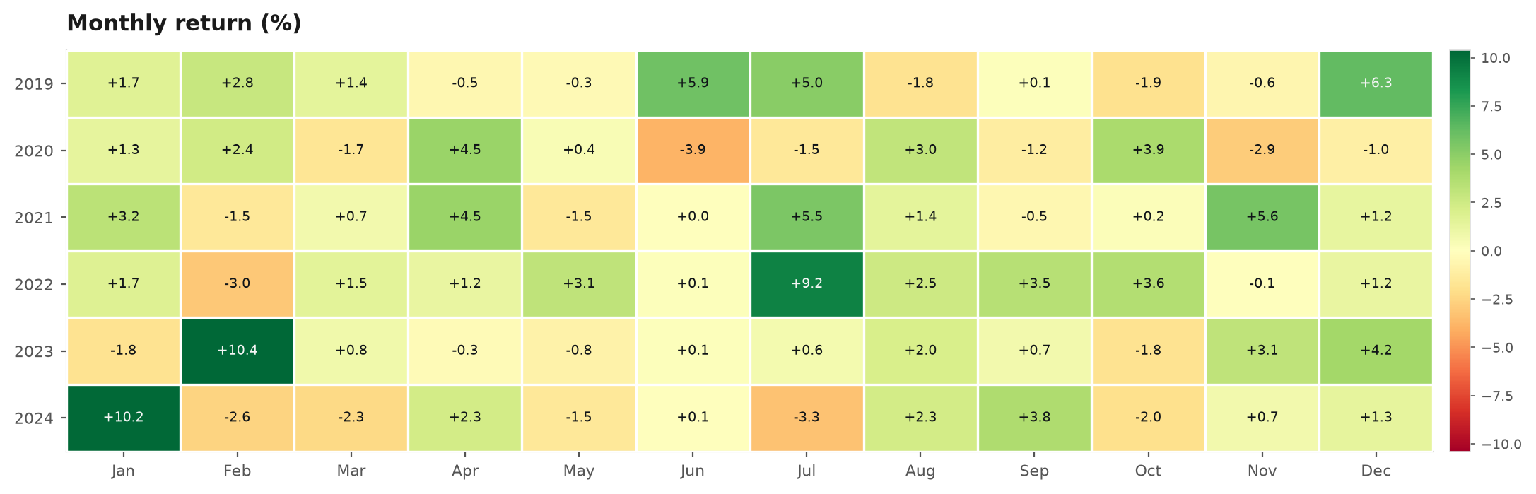
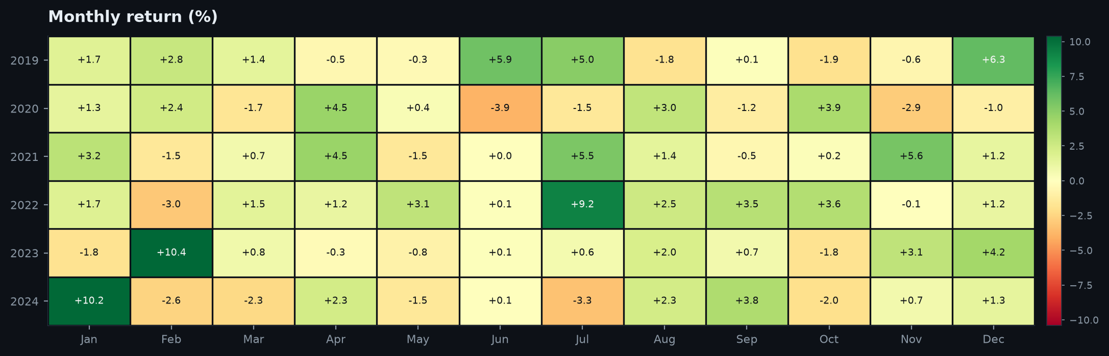
Monthly returns heatmap
Monthly returns heatmap — Year × month grid, diverging colour centered at zero.

Distribution & trades#

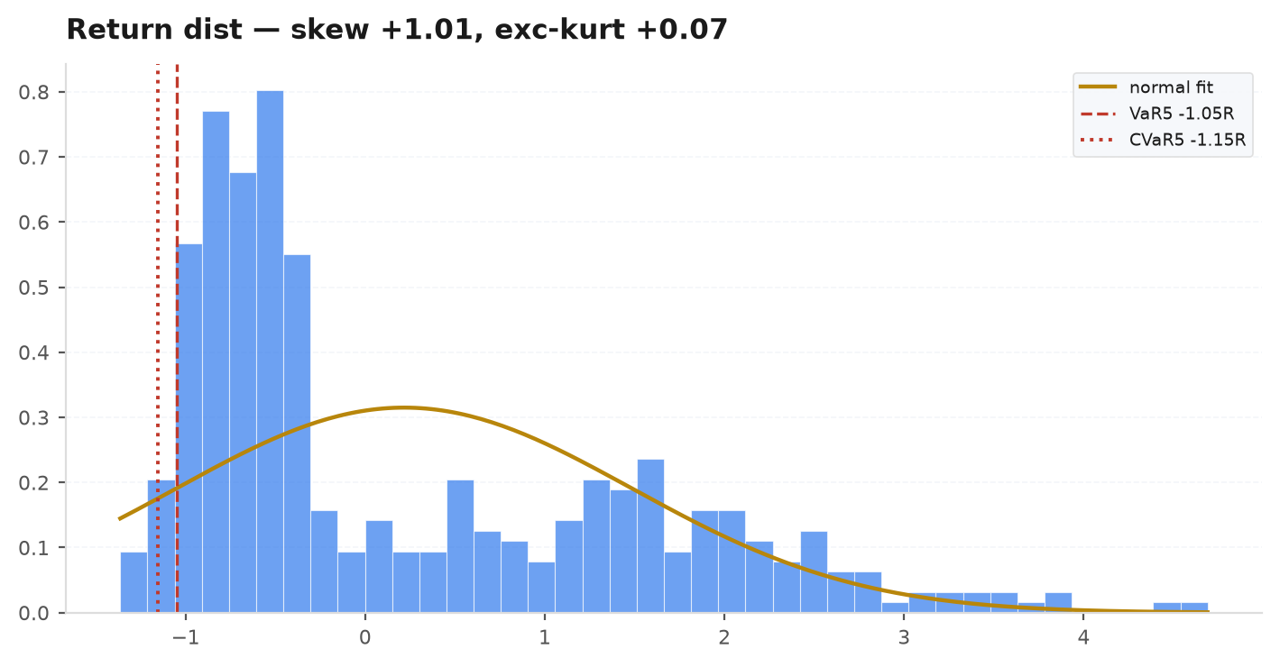
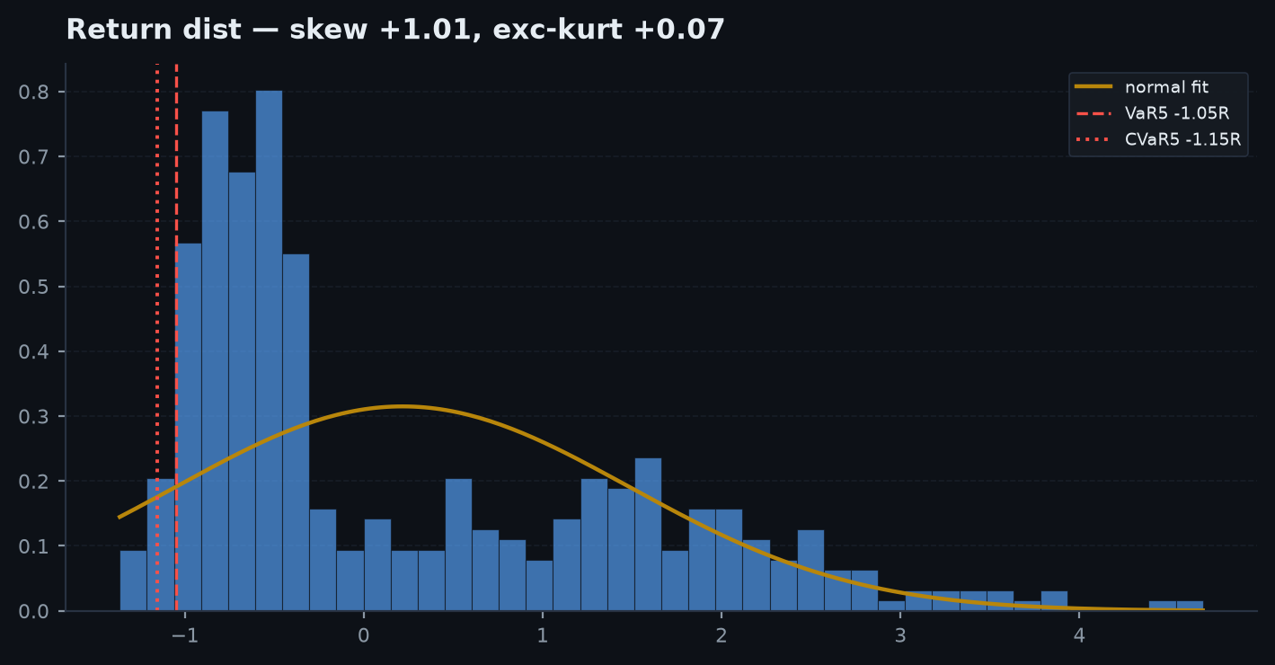
Return distribution
Return distribution — Per-trade R with a fitted normal overlay and VaR/CVaR lines; skew & kurtosis in the title.
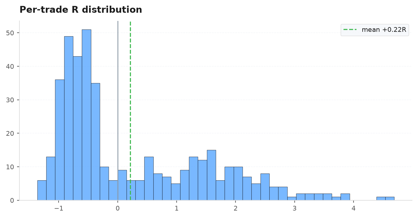
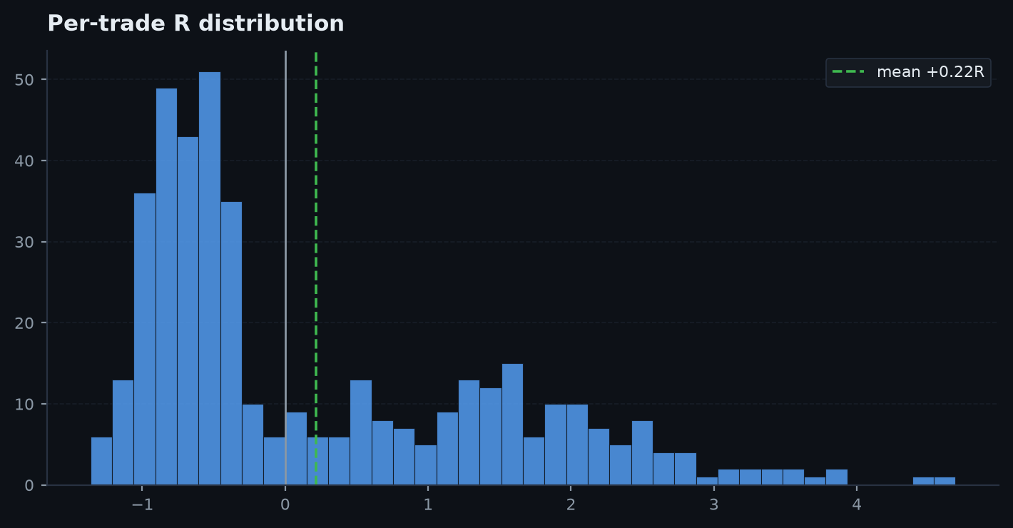
R-multiple histogram
R-multiple histogram — The raw distribution of per-trade R with the mean marked.
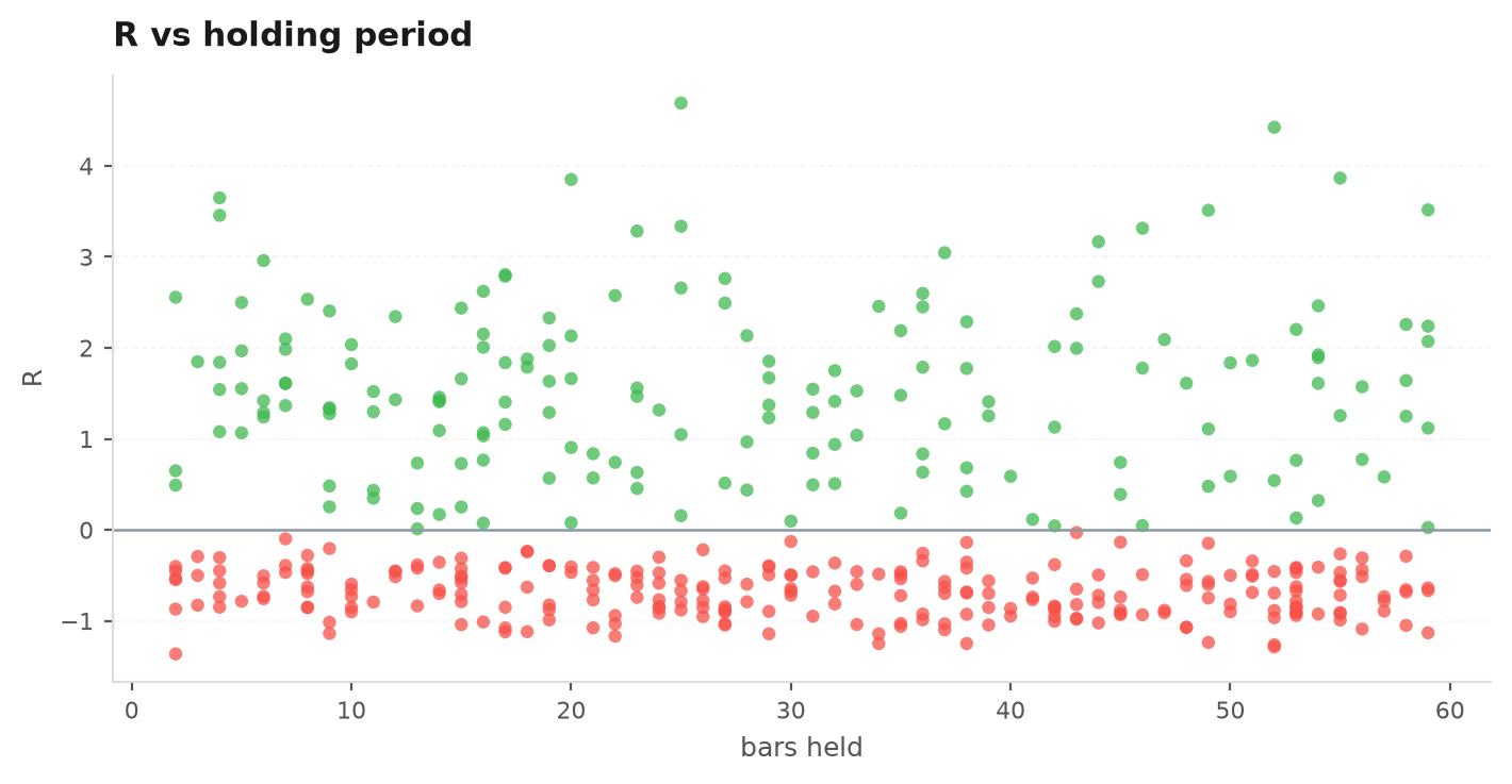
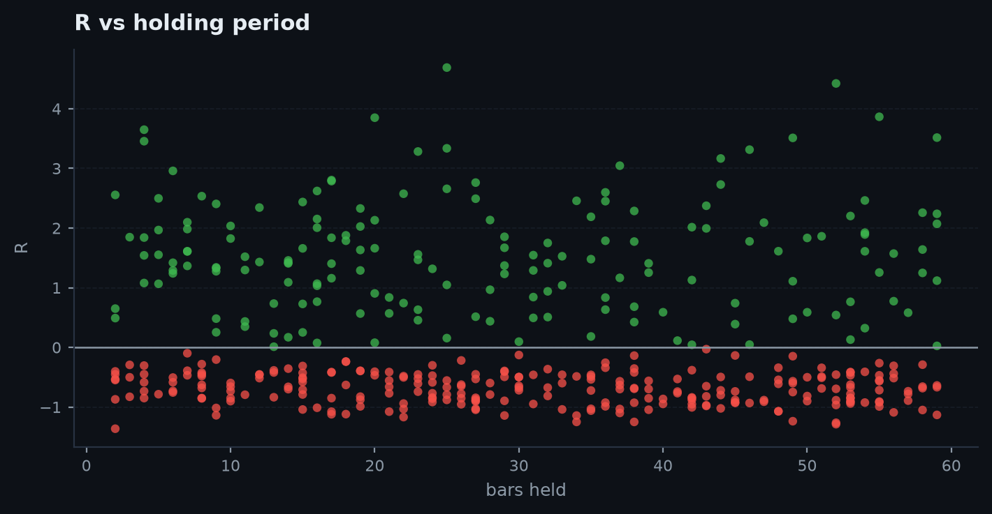
R vs holding time
R vs holding time — Each trade's R against how long it was held, coloured by sign.
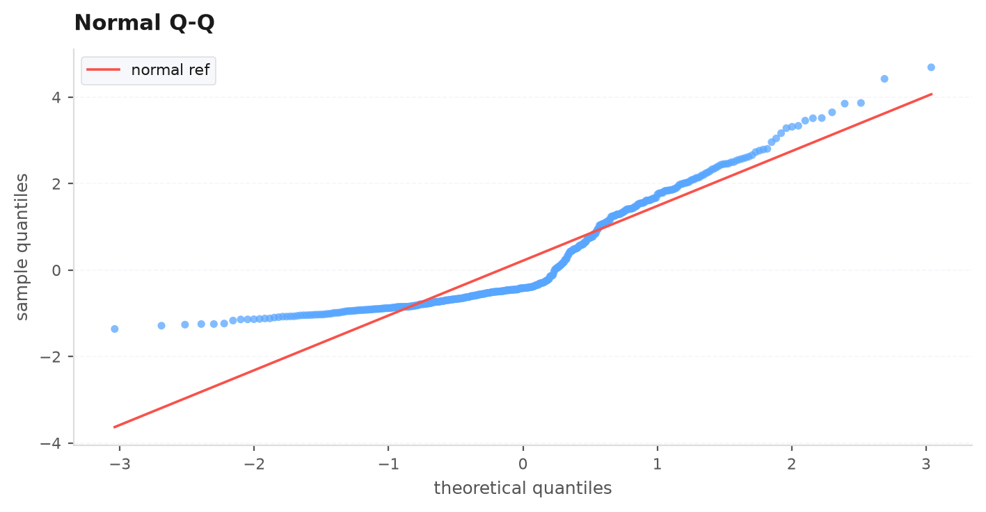
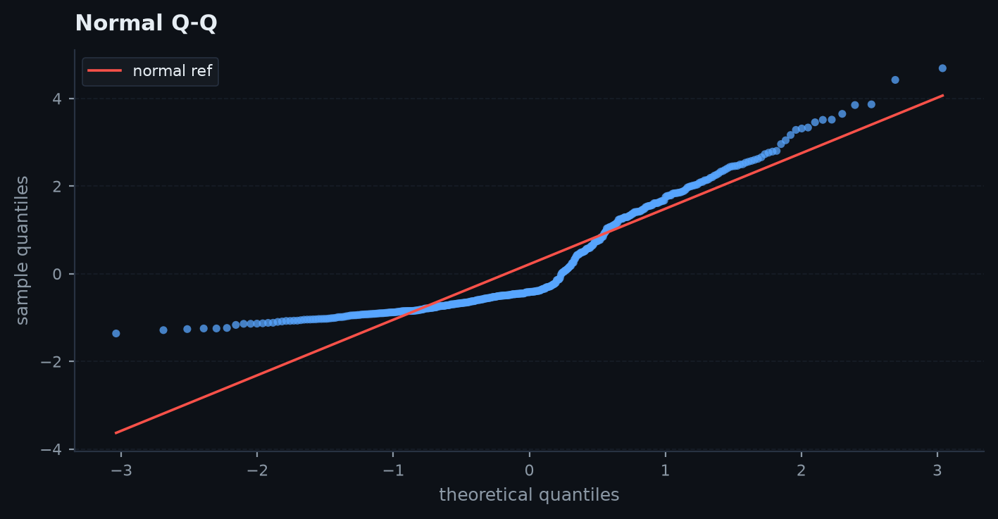
Q–Q plot
Q–Q plot — Sample quantiles vs the normal — fat tails show as departures from the line.
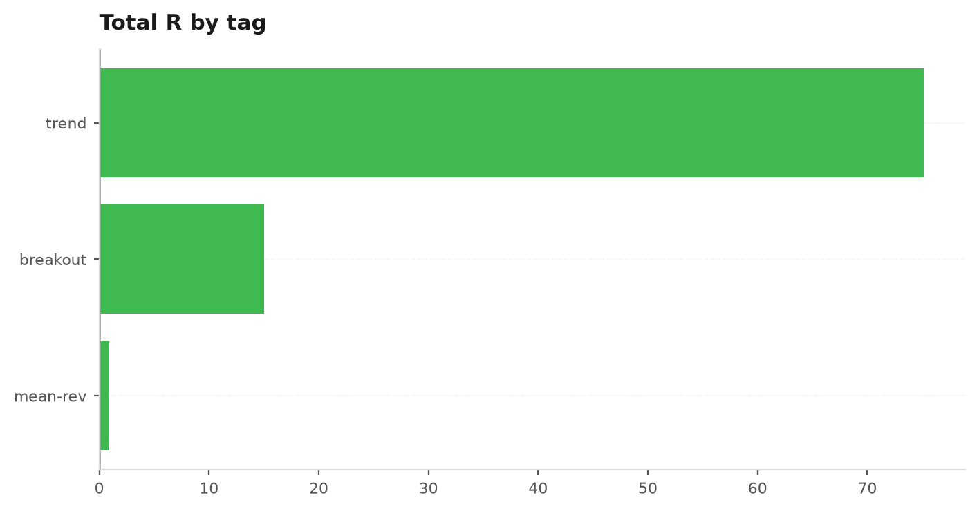
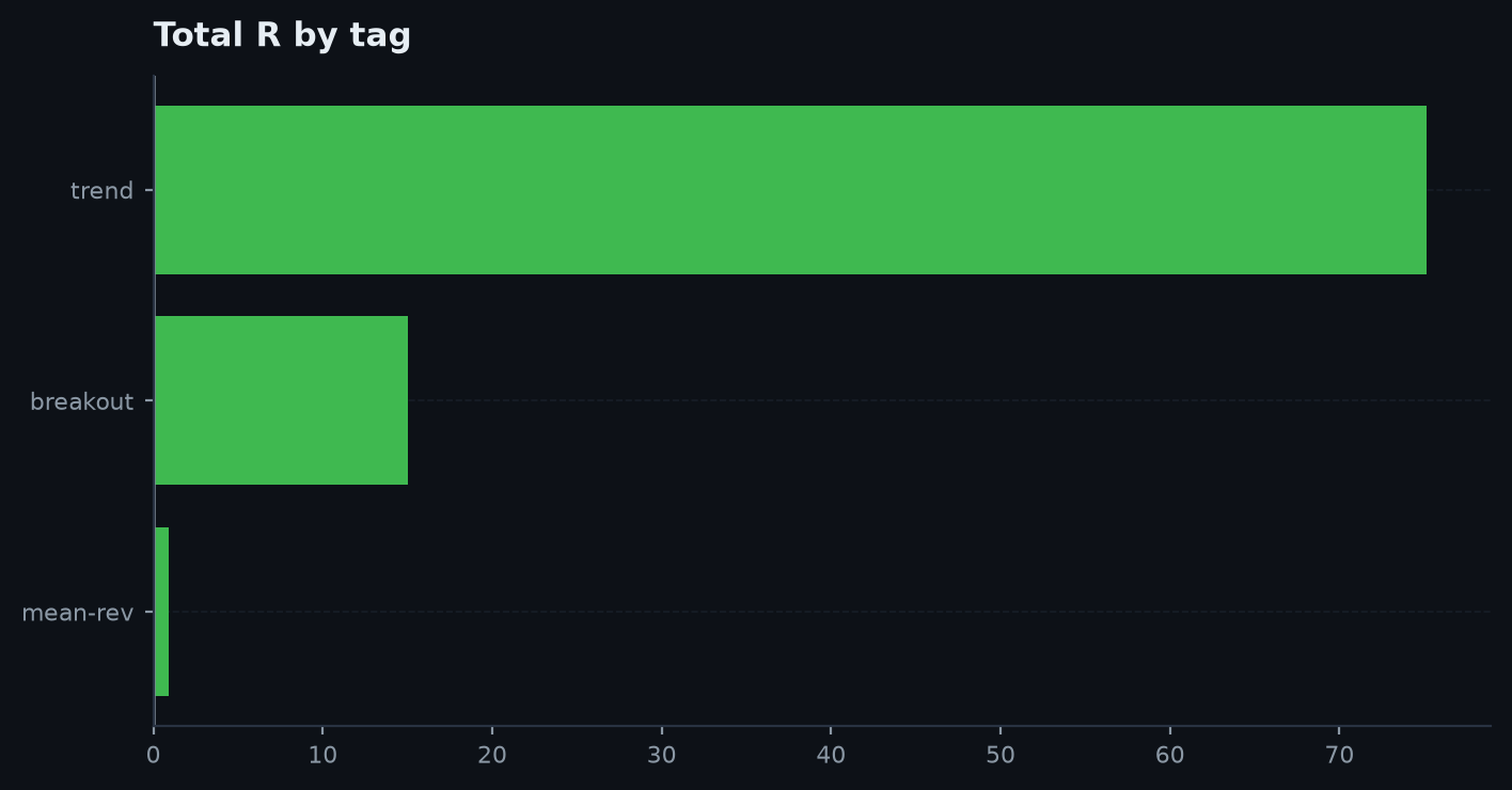
Contribution by tag
Contribution by tag — Total R grouped by strategy/instrument tag.
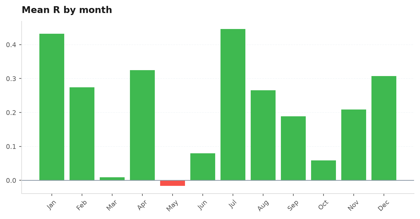
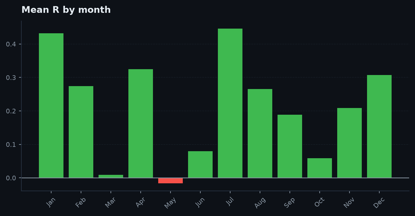
Seasonality
Seasonality — Mean R by calendar month (or weekday).

Portfolio & the gauntlet#

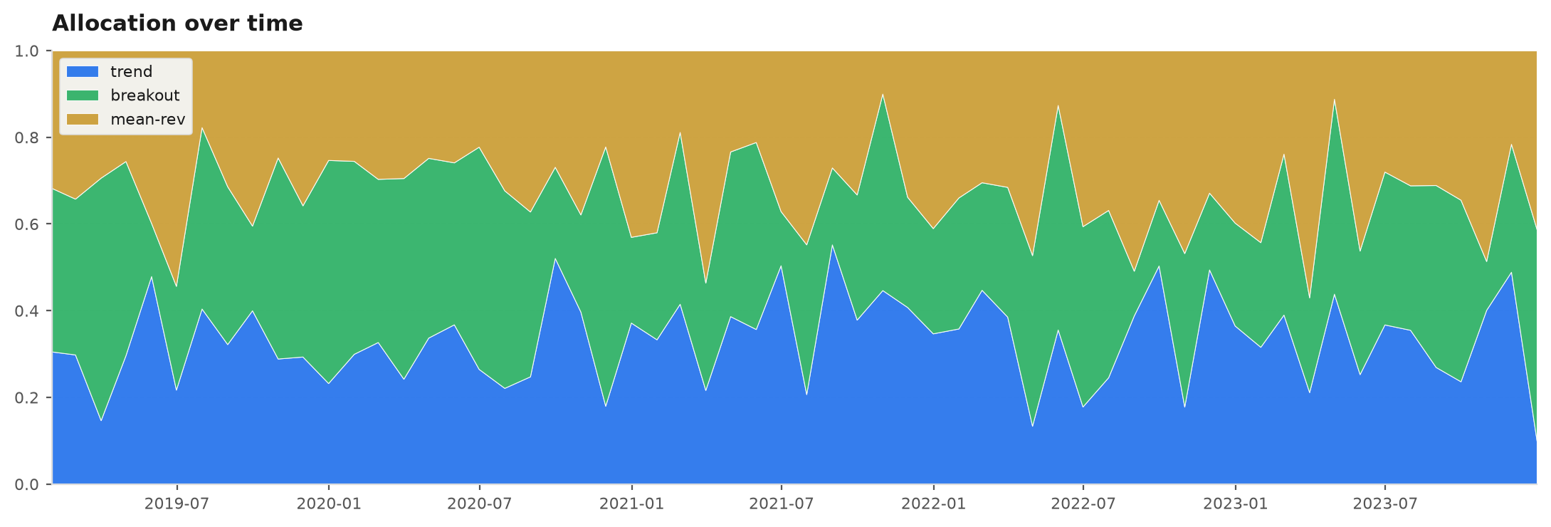
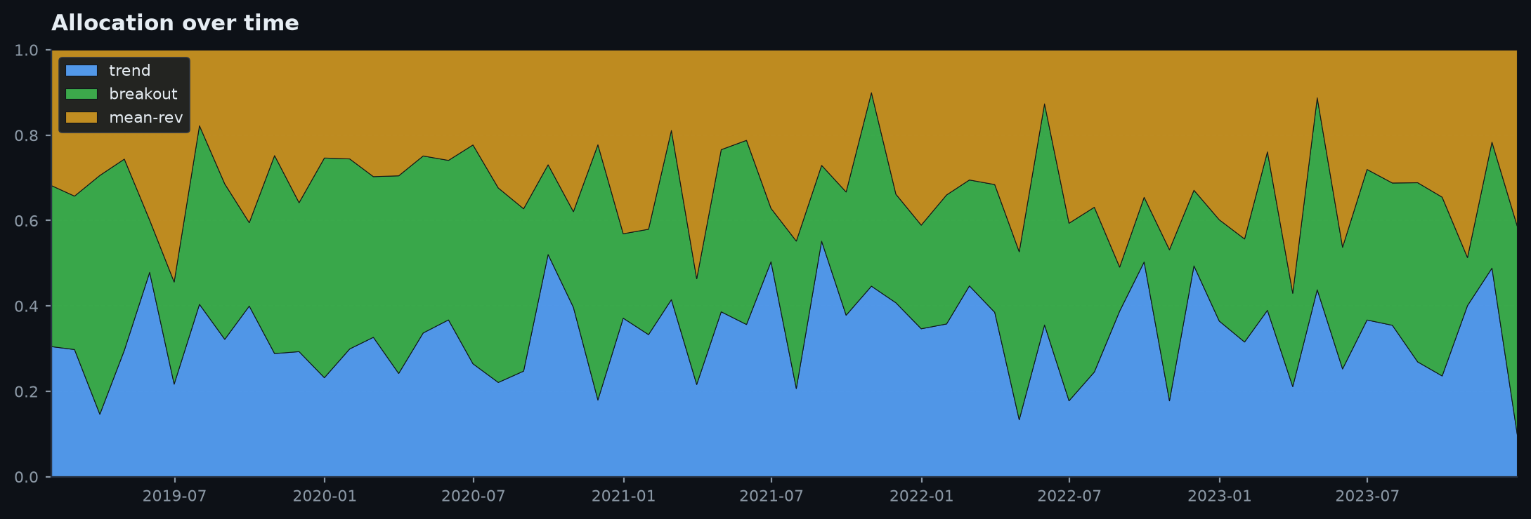
Allocation over time
Allocation over time — Stacked area of book weights as they drift.
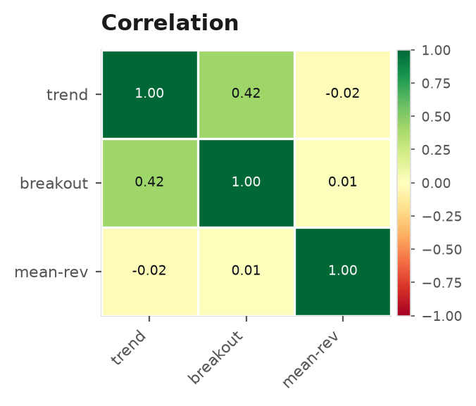
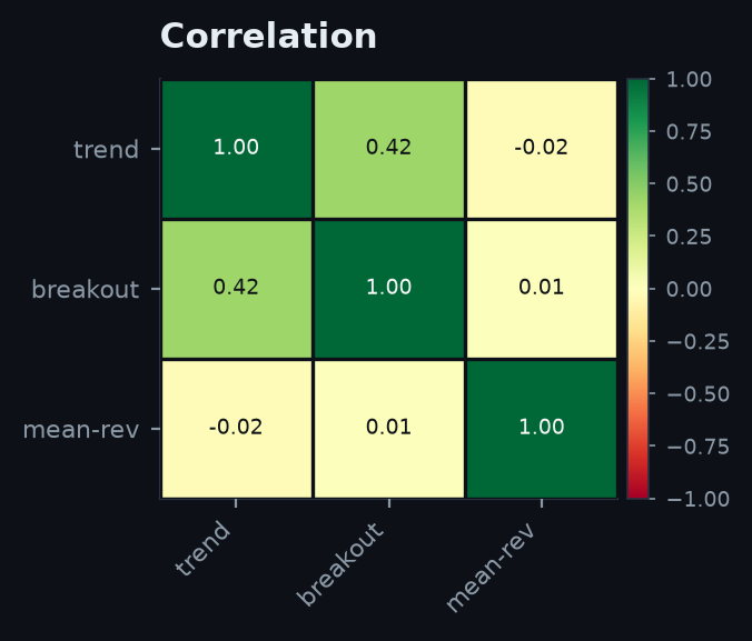
Correlation heatmap
Correlation heatmap — Pairwise correlation across books, diverging colour.
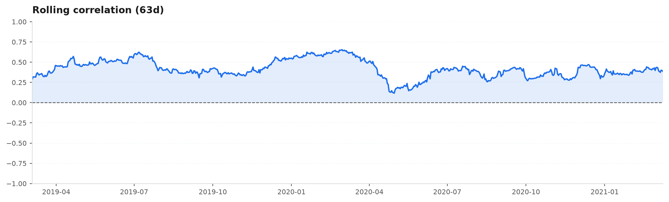
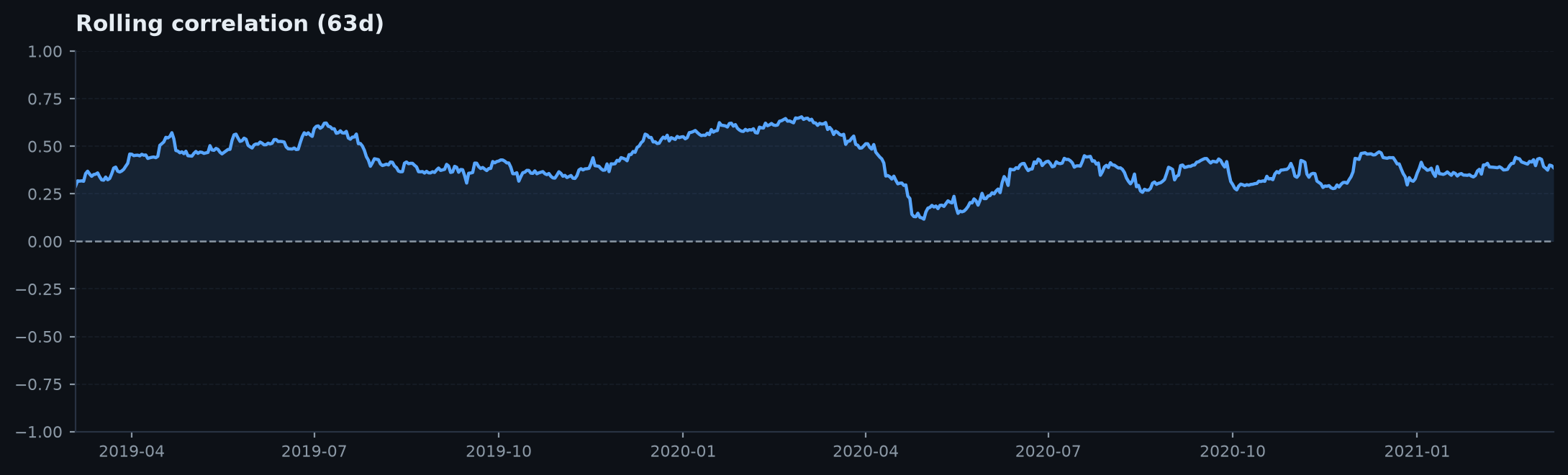
Rolling correlation
Rolling correlation — How two books' correlation moves through time.
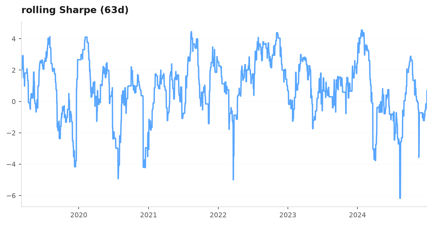
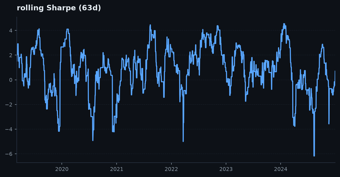
Rolling metrics
Rolling metrics — A rolling Sharpe (or PF / win-rate) to see when the edge worked.
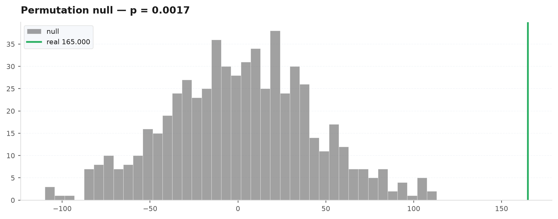
Permutation null
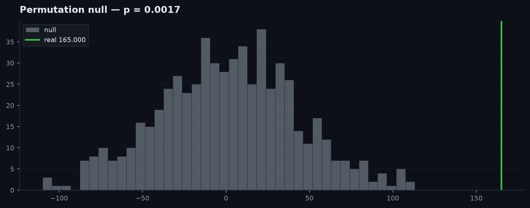
Permutation null — The null distribution with the real result marked — the picture behind the p-value.
Cost sensitivity
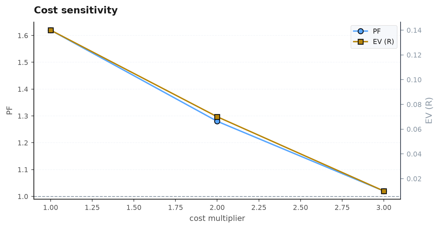
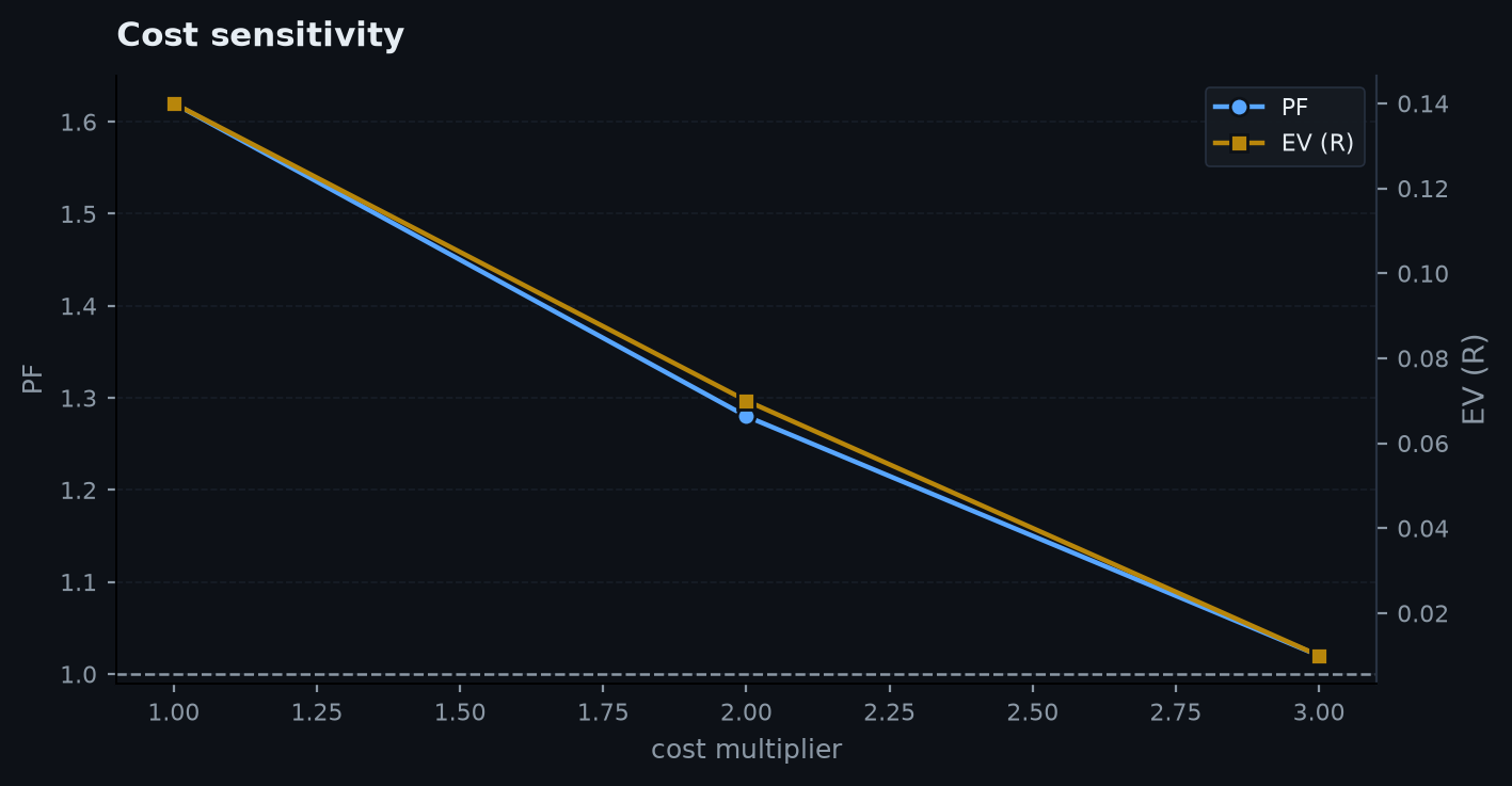
Cost sensitivity — Profit factor and expectancy as costs scale 1× → 3×.
Per-year regime
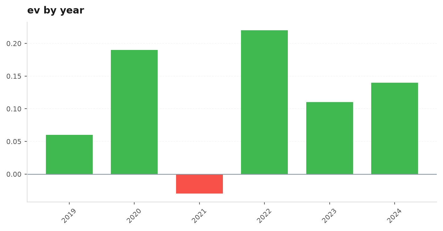
Per-year regime — Expectancy (or PF) broken out by year — where it earned and where it didn't.