Reports & charts
edgekit renders a validated backtest into a single self-contained HTML file — every chart base64-inlined, every style in one <style> block, zero external requests. This guide covers the chart vocabulary in viz, the chainable Report builder, and three_report_suite, which emits the linked Challenge / Live / Realistic trio in one call.
Browse the whole chart vocabulary rendered out at the chart gallery.
edgekit.viz imports matplotlib inside its functions, so import edgekit stays lean. Install it when you render: pip install edgekit[viz]. A missing install gives a clear pointer rather than a stack trace. edgekit.report reaches matplotlib only through viz.From trades to plottable series#
Charts consume the canonical trade frame (date + r + dir). Two helpers derive the series everything else plots:
| Helper | Returns |
|---|---|
trades_to_daily(trades, account=None) | net R per calendar day on a gap-filled calendar (0 on untraded days); dollars if account given |
trades_to_monthly(trades, account=None) | month-end summed series (R, or dollars) |
import edgekit as ek
from edgekit import viz

bars   = ek.data.load_bars("US100_M1.csv")
rth    = bars[ek.data.rth_mask(bars.index, start="09:30", end="16:00", tz="America/New_York")]
trades = ek.strategy.ORB(or_bars=30, target_r=2.0).backtest(rth, warmup=5, bars_per_day=390)

daily   = viz.trades_to_daily(trades)          # R per day
monthly = viz.trades_to_monthly(trades)        # R per month
equity  = daily.cumsum()                        # cumulative R curve
The fast path: tear_sheet#
Before wiring charts by hand, reach for tear_sheet — one call turns a trade frame into a complete self-contained page: a hero and KPI row from trade_stats, an equity+drawdown panel, a monthly-return heatmap, a return distribution and R histogram, and a metrics table. Pass account (dollars-per-R) to add a dollar heatmap; pass out to write to disk (it returns the Path), or omit it to get the HTML string back.
from edgekit.report import tear_sheet

path = tear_sheet(trades, account=500.0,
                  title="ORB — US100 M1", theme="dark", out="orb_tearsheet.html")
print(path)   # -> orb_tearsheet.html (self-contained; net-negative edge, shown for the mechanics)
The chart primitives#
viz splits into axes-level charts (you pass a matplotlib ax, they draw onto it and return it) and figure-level charts (they return a whole Figure). Grab matplotlib through viz._plt() so you inherit the Agg backend.
plt = viz._plt()
fig, (ax1, ax2) = plt.subplots(2, 1, figsize=(9, 6))

viz.equity_curve(ax1, equity, label="ORB")        # cumulative curve
viz.drawdown(ax2, equity, cap=0.10)                # underwater plot; cap draws the hard limit line
b64 = viz.fig_to_base64(fig)                        # render to base64 PNG and close
Axes-level charts: equity_curve, drawdown, monthly_bars, yearly_bars, r_histogram, draw_candles, trade_overlay (▲ long / ▼ short markers coloured by R). Figure-level charts return a ready-to-embed figure:
| Figure chart | What it shows |
|---|---|
monthly_heatmap(monthly, theme) | year × month RdYlGn grid of returns |
mc_fan(paths, actual=None, theme) | 5/25/50/75/95 percentile fan of Monte-Carlo paths, actual overlaid |
corr_heatmap(corr, theme) | correlation-matrix heatmap from a square DataFrame |
heat = viz.monthly_heatmap(monthly, theme="dark", title="Monthly R")

# a Monte-Carlo fan from the block-bootstrap
mc = ek.validation.block_bootstrap_mc(daily.to_numpy(), horizon=252, n=5000)
fan = viz.mc_fan(mc["terminal"].reshape(-1, 1), theme="dark")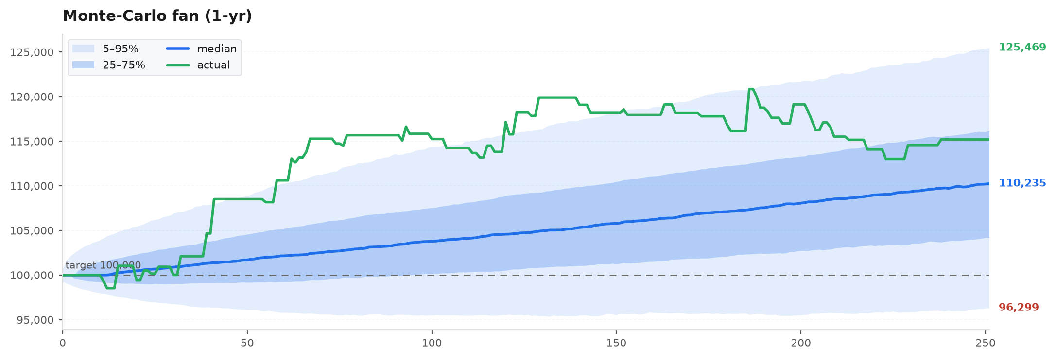
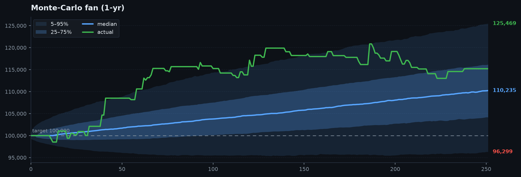
theme="dark" (GitHub-dark #0d1117) or "light" (blue-accent print). The THEMES dict and theme(name) lookup expose the palettes if you want to match your own styling.Two charts you will reach for constantly#
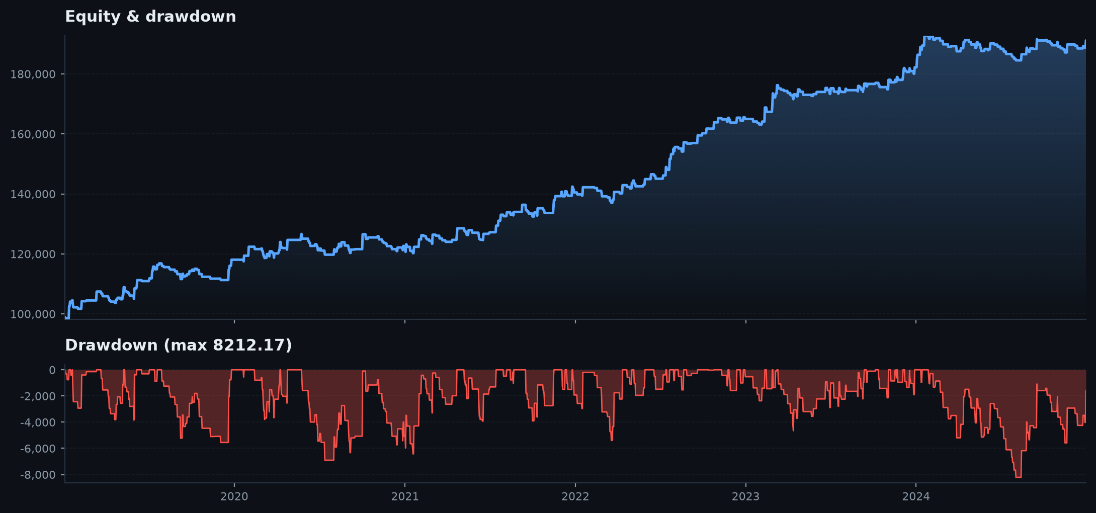
equity_with_drawdown is the single most-read backtest picture — a figure-level panel stacking the equity curve over its underwater drawdown, so the pain reads at the same x as the gains. rolling_metrics is the durability check: rolling Sharpe / PF / win-rate over the daily-R series. A flat-ish line is a durable edge; a curve that decays to zero after the design window is the classic overfit signature.
fig = viz.equity_with_drawdown(daily.cumsum(), theme="dark", title="Cumulative R")

# durability: rolling Sharpe over a 63-day (one quarter) window
plt = viz._plt()
f, ax = plt.subplots(figsize=(9, 3.2))
viz.rolling_metrics(ax, daily, window=63, metric="sharpe")   # or metric="pf" / "win"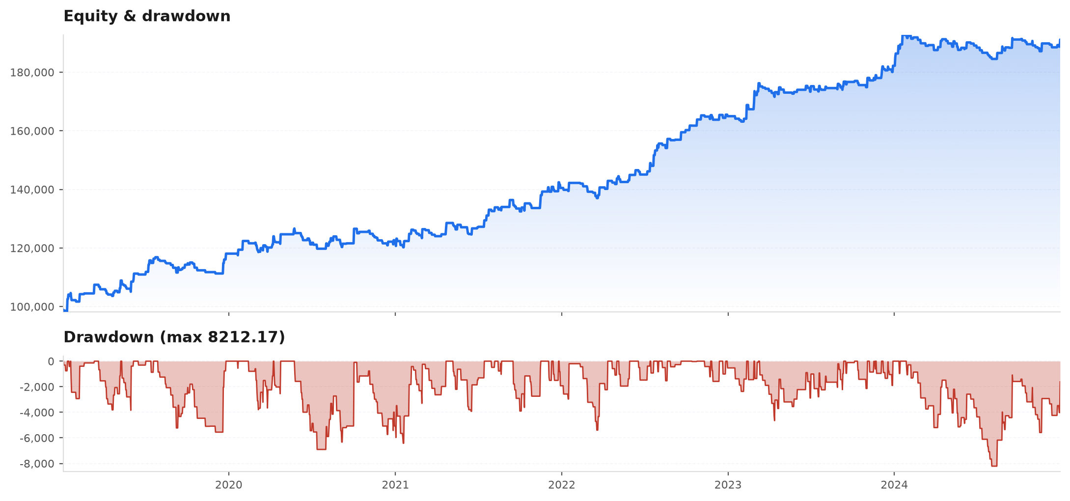
Visualize the gauntlet#
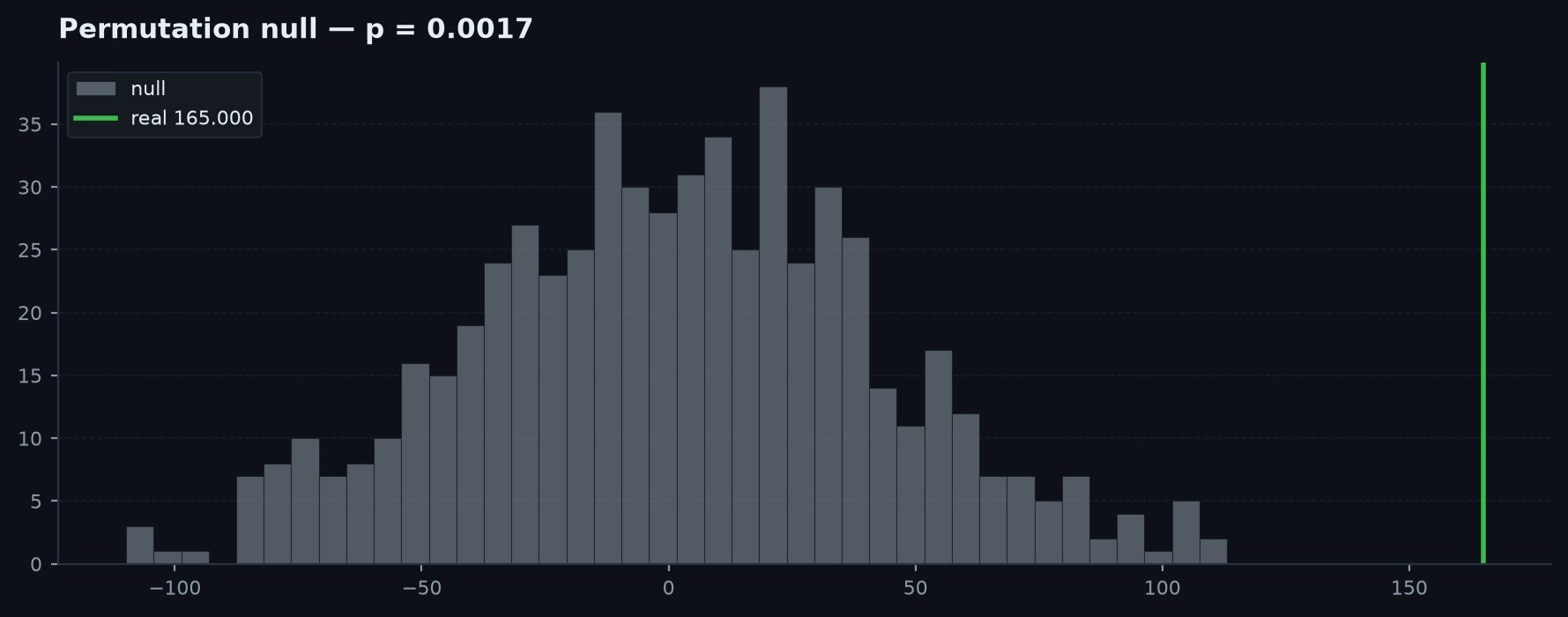
Two charts turn the validation numbers into pictures. permutation_hist draws the null distribution with the real statistic as a line and the p-value in the title — p = (#{null >= real} + 1) / (N + 1). A real stat deep in the right tail (p<0.01) is unlikely to be luck; one sitting inside the null cloud is noise. cost_sensitivity plots PF and EV-R against a rising cost multiplier straight from costs.cost_stress: a real edge holds PF>1 at 2–3x, a fragile one collapses.
plt = viz._plt()
fig, (a, b) = plt.subplots(1, 2, figsize=(12, 4))

# permutation null vs the observed statistic
perm = ek.validation.mcpt(trades["r"].to_numpy(), n=1000)
viz.permutation_hist(perm["null"], perm["stat"], title="Permutation null (EV-R)")

# cost stress: does the edge survive 2x / 3x costs?
stress = ek.costs.cost_stress(trades["r"].to_numpy(), mults=(1, 2, 3))
viz.cost_sensitivity(b, stress)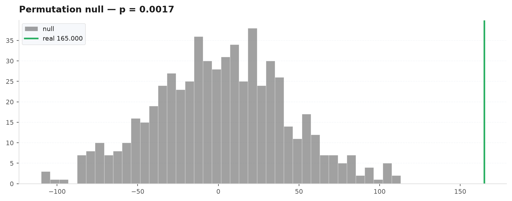
The Report builder#
Report assembles one self-contained HTML page. Every method returns self, so you build a report as a single chained expression. chart(fig) embeds a matplotlib figure as an inline base64 PNG (and closes it); render() returns the full <!doctype html> string and write(path) saves it.
from edgekit.report import Report

stats = ek.trade_stats(trades.r.to_numpy(), dates=trades.date)
plt = viz._plt()
fig, ax = plt.subplots(figsize=(9, 3.5))
viz.equity_curve(ax, equity, label="ORB")

(Report("ORB — US100 M1", meta="30-min opening range · $100k", theme="dark")
    .hero("Profit factor", "0.71", "net-negative after costs — rejected")
    .kpi_row([("PF", f"{stats['pf']:.2f}", f"win {stats['win_rate']:.0%}"),
              ("EV", f"{stats['ev_r']:+.3f}R", f"{stats['n']} trades"),
              ("MAR", f"{stats['mar']:.2f}", ""),
              {"label": "Perm p", "val": "0.040"}])
    .section("Equity")
    .chart(fig)
    .section("Monthly")
    .month_table(monthly)
    .caveat("No edge: PF < 1, fails cost-stress at 1x. Shown to demonstrate the report builder.")
    .write("orb_report.html"))
The builder methods:
| Method | Adds |
|---|---|
header(title, meta) | reset the page title / meta line |
nav(links) | a row of (label, href) cross-links |
hero(label, value, sub) | the big highlighted headline number |
kpi_row(cards) | a flex row of KPI cards — each a (label, val[, sub]) tuple or a dict |
card(label, val, sub) | a single KPI card |
section(title) | an <h2> heading |
table(headers, rows) | a plain table |
month_table(monthly) | year × month grid with row totals |
chart(fig, dpi=95) | an inline base64 PNG of a matplotlib figure |
caveat(text) | a muted caveat box |
html_text(raw) | a raw HTML fragment verbatim |
render() / write(path) | the full HTML string / write it to disk |
The three-report suite#
The honest way to present a strategy is not one number but three. three_report_suite sizes the trade R-stream to dd_budget of the account and renders three cross-linked self-contained pages: the aggressive Challenge view, the Live ceiling, and the haircut-adjusted Realistic view (default 0.85).
from edgekit.report import three_report_suite

paths = three_report_suite(trades, account=100_000, out_dir="reports/",
                           title_prefix="ORB", theme="dark",
                           dd_budget=0.095, haircut=0.85, split=0.90)
print(paths) # [challenge.html, live.html, realistic.html] — cross-linked, each standalonedata:image/png;base64, URI and the CSS is inlined, so the output opens anywhere — email it, drop it on a share, open it offline. There are zero network requests, which is also why the file is trustworthy: nothing can change after you write it.Next#
- API · viz — every chart primitive and theme.
- API · report — the Report builder and three_report_suite.
- Prop-firm sizing — the sizing that feeds the Challenge report.
- Example: the ORB gauntlet — the report at the end of the pipeline.